
Orthodontics Module
A new dental module to improve patient monitoring and documentation specialized for orthodontics | @Epic
Role
Lead Designer: End-to-End UX / UI & Branding
Timeframe
Dec 2022 - Mar 2024
Tools
Adobe Xd / Ai / Ps | Microsoft Forms / Powerpoint / Word
NDA Protected
•
NDA Protected •
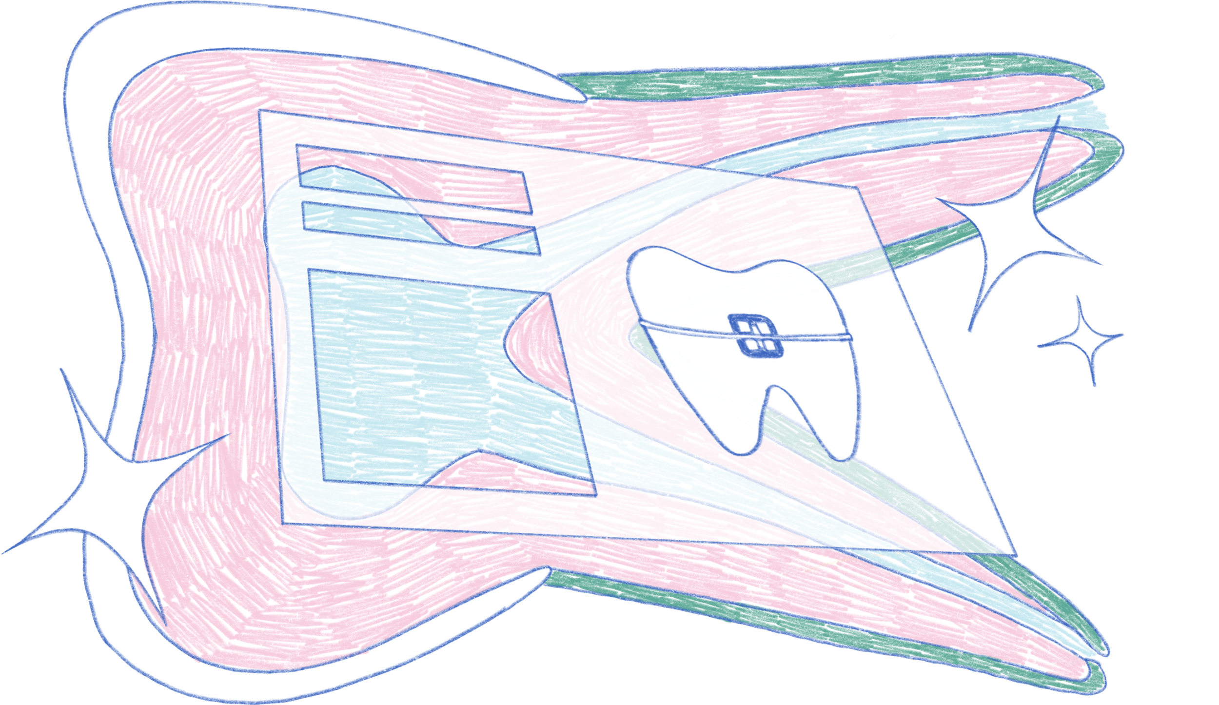
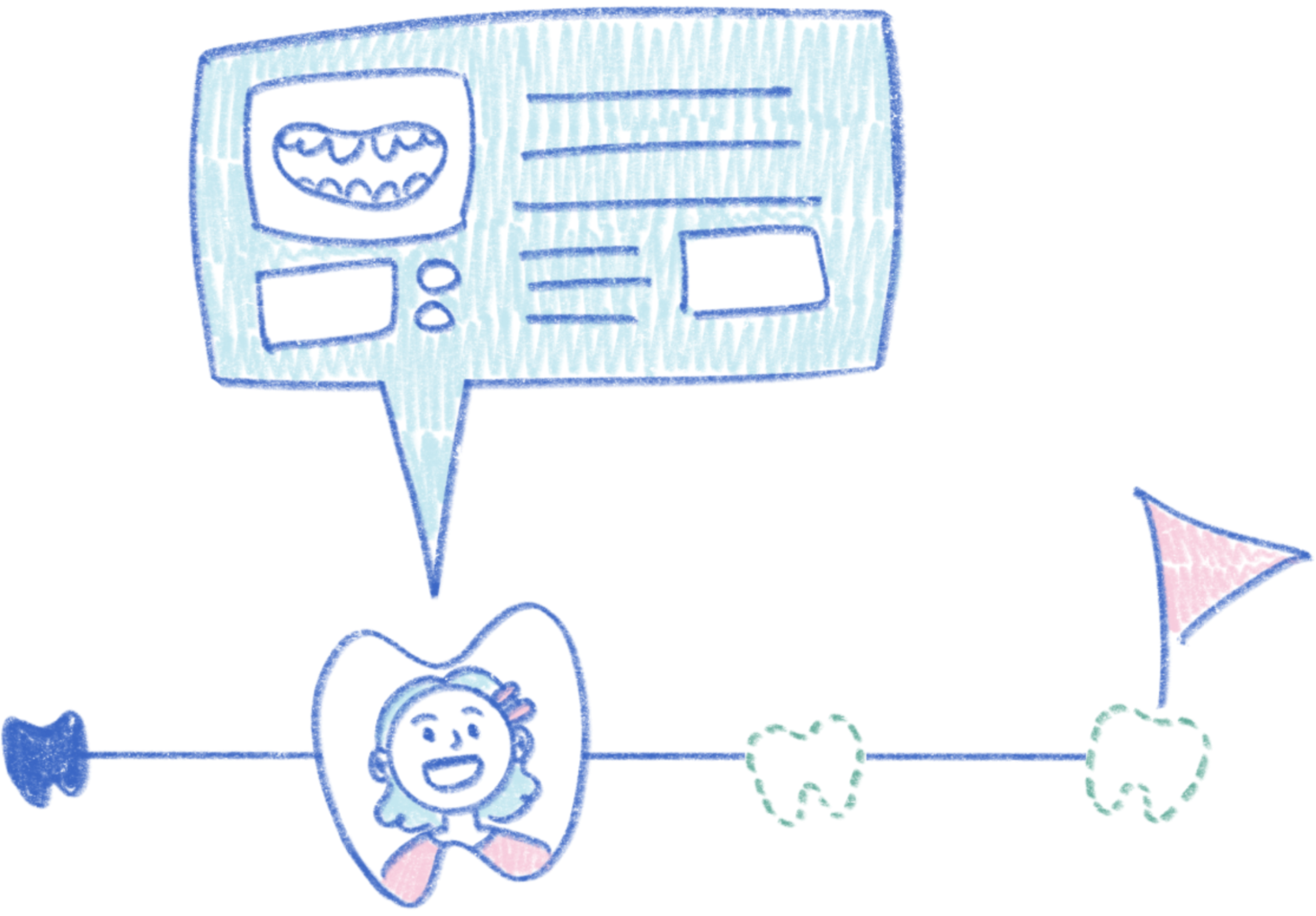
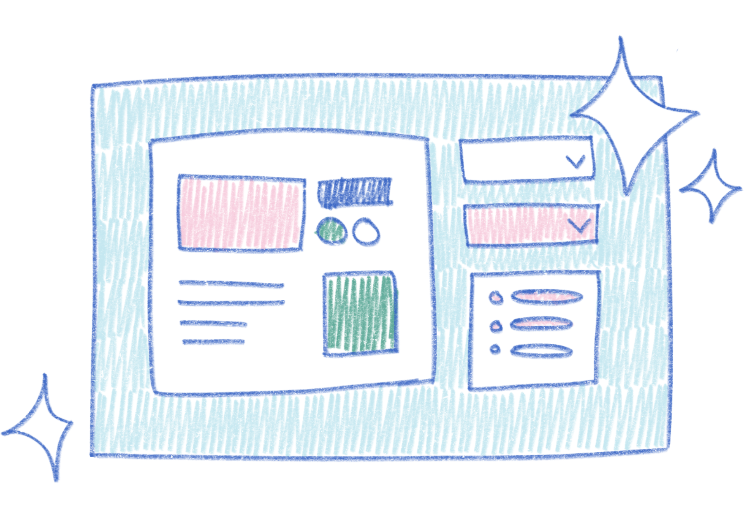
Due to the NDA, I can’t show any project visuals or in-depth details.
Instead, I will provide a general overview for context, and focus on the process and outcomes.
Project overview

The problem
Our orthodontic users would use Wisdom, primarily a general dentistry application, which did not fit their needs. The functional gap caused user dissatisfaction due to having to undergo tedious workflows and data inconsistency within the same organization due to varying documentation methods done by users.
Our solution
Since ortho’s workflow is different from what’s seen in general dentistry, a new module was needed to fully address to the needs of our ortho users:
EFFICIENT DOCUMENTATION
streamline the process, having pre-created forms in system to follow
support consistency that addresses common documentation cross organizations, allowing easy patient record transfers

PATIENT TREATMENT REVIEW
Since orthodontics treatment can take over the course of a few years or more:
keeping track of progress and key info that may need to be seen for the next visit
content easy to parse
provide a timeline view
Research
To get a solid idea of the current user flow, needs and pain points, I was in contact with more than 6 dental organizations. These involved scheduling and leading meetings with administration leaders and our end users consisting of orthodontists, oral surgeons, dental assistants, and hygienists.
While conducting user interviews and on-site shadowing of our end users, my research goals were:
identify and explore common workflows between our providers and organizations
analyze documentation patterns and processes our end users go through
Findings
From narrowing down commonalities shared, we identified the following functional must haves:
efficient tracking of progress and review of past visits

optimized documentation for treatment stages and supplemental content access
simple and intuitive layout that’s quickly understandable across different roles

Design
With a better understanding of our users and their workflows, I worked with developers to create various low-fidelity wireframes.
From our top wireframes, I created prototypes and conducted user testing to identify the most intuitive and efficient layout. With these results, we were able to narrow down features to focus on.
Feed-back loop
Hi-fidelity mockups were created for an accurate feel of the product before further development. To ensure our final product aligned with our goals, after every iteration, we conducted project reviews with our team and reached out to our customers for feedback.

Branding - elements of joy
To fit with Epic Systems’ “joy to use”, I designed new icons, zero state imagery, and celebratory visuals for finished treatments - all custom to orthodontics.
We also involved our end-users for design feedback. Review was positive, with some end-users stating excitement to show these visuals to their patients.
Outcomes
Overall, our end-users reacted positively to our new activity and showed excitement to work in a system customized to them
A handful of our customers chose to be part of the first release of our module, where it is used by all of their orthodontic clinics
Users that adopted the new module reported more efficient documentation and higher satisfaction with navigating the layout
Key takeaways
Addressing differences - standing by the end-user
Given the wide range of organizations and roles, there were differing priorities which caused pauses in the beginning. To move the design forward, we pulled from our on-site observations with our end-users to better identify commonalities, formulate core questions for feedback, and advocate certain decisions.
Levels of fidelity - knowing the audience
Most of our users are detail-oriented, where mock-ups either had to be very simplified or high-fidelity to avoid off-topic discussion during presentations. This made me more meticulous over what to block out without taking away from the purpose of the visual and double checking that the dental content makes clinical sense.
From the Team
⋆᪥⋆
From the Team ⋆᪥⋆
"I have worked Nini on a few occasions relating to the Orthodontics project on Wisdom. She was very helpful in designing some images for our zero-state UI. She also did a nice job working on a one pager to share with customers, possibly going a bit beyond her comfort zone since it required a lot of writing, not just visual/design work."
Software developer manager"Nini is fun to work with and she has great design instincts. She also created a clever celebration visual she created for Orthodontics. It cleverly showcases [UI Visuals] while also managing to be super cute. Nini is certainly an asset to the Wisdom team."
quality manager"Nini's design skills and her ability to execute on mockups have impressed me. This has been extremely helpful as Wisdom has tried to rapidly iterate on our designs for the new Orthodontics module."
software developer