
Provisions
Anxious about entering a new restaurant? Let Provisions help relieve your fears by giving you the means to expect the expected.
Project Background
“I get anxious when eating out at a new place outside my comfort zone, so it would be very helpful if I could get an idea of how the dining process goes and general etiquette.”
- Mitchell S., from user interviews
Role
Visual & UX/UI Design, Research, Concept Development
Time Frame
1 month
Problem
As of now, there does not exist a main resource that details what is to be expected at a restaurant in terms of the experience, so people can only find such information by either reaching out to an experienced person or specifically asking on an online forum.
Goal
Design Provisions to be a go-to resource where users easily access information that lessens and possibly eliminates feelings of anxiety and stress when entering a new restaurant.
Research
User Research
I conducted 5 user interviews where:
the participant age range was 18-50
2 participants were non-native English speakers
3 participants prefer Google Maps and the other 2 prefer Yelp to look at new restaurants
3 participants have dietary restrictions
1 participant uses a wheelchair
Identifying the main needs and goals of the users, I represented them with the personas Jules and Aaron.
Competitive Audit
I was unable to find an existing product on the market where the core functionality was to help users know what to expect when entering a new restaurant. Instead, I looked into services that contained features that would help users do so.
Ideation
Brainstorming
Based on the data from the user interviews and features seen from the competitors, I quickly brainstormed what Provisions could provide the user.
Information Architecture
While creating the information architecture, I held mini user reviews for people to provide insights for improvements. These reviews involved asking for general input and an optional hands-on process of sorting the features in a way they best saw fit.
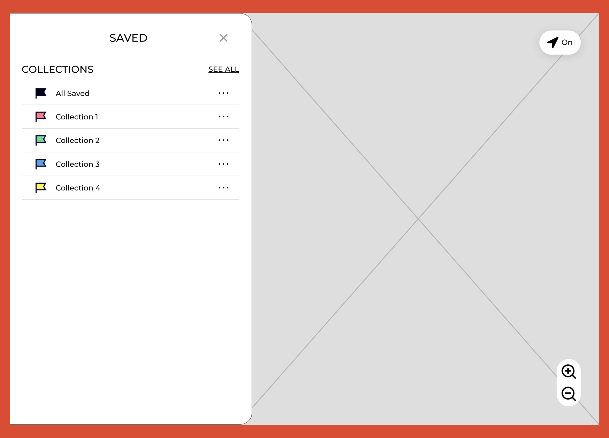
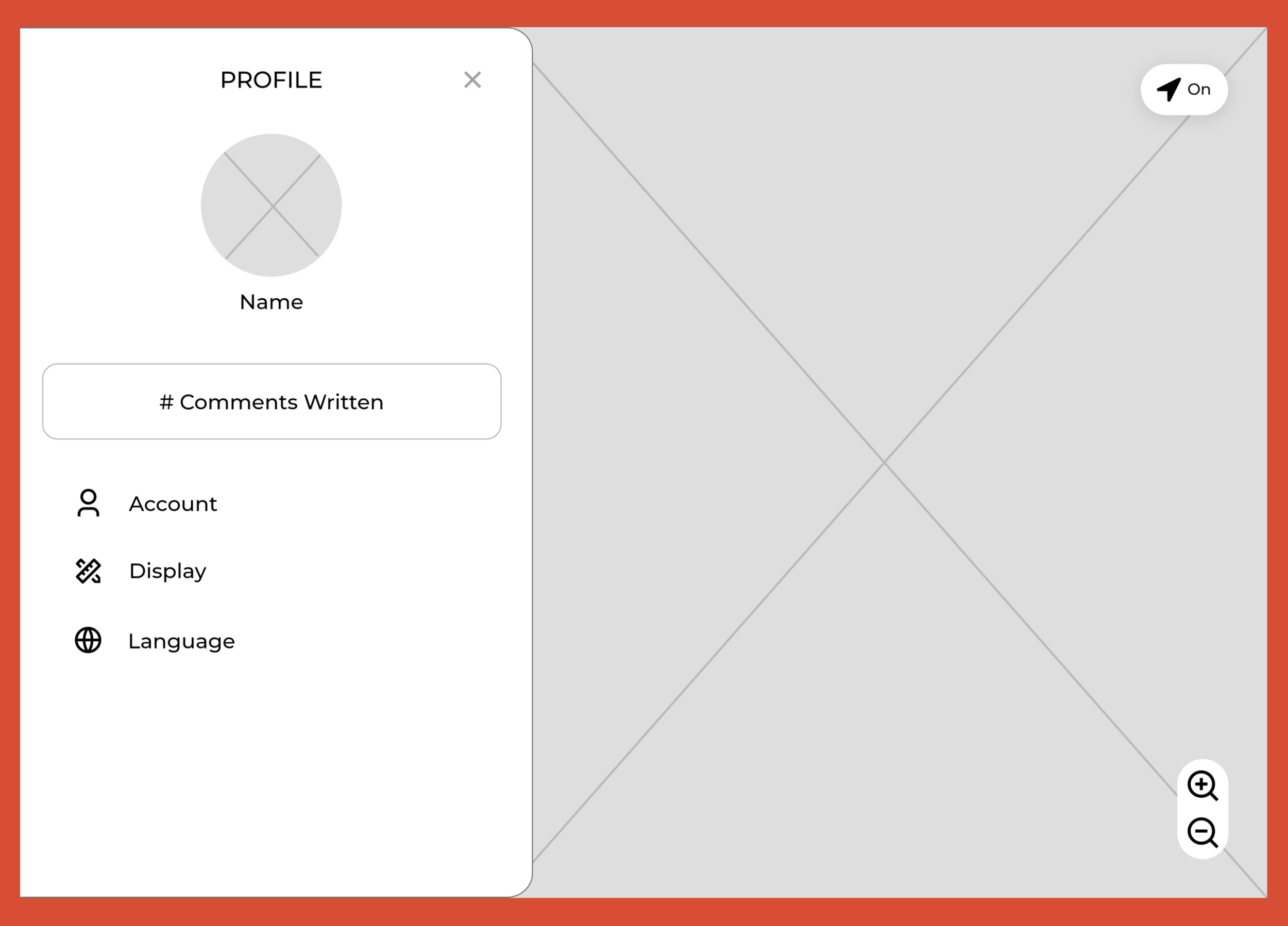
The reviews supported my initial hypothesis that users preferred a similar structure to what's seen in major resources, such as Google Maps or Yelp, since it is familiar and thus easier to pick up. When it came to organizing the features, the majority closely matched what I designed. However, one major conflict was “Location Sharing,” which was initially positioned under Profile. 4/5 users preferred for the feature to be in its own section on the homepage so they could quickly see if their location was being shared. The design was updated accordingly.
Design
Wireframing
During the user interviews, many of them commented how they wanted to avoid having to enter a new page as much as possible when it came to going through content. With this in mind, my main goals in screen designing were to make content easily accessible and reduce having to redirect to a new page as much as possible. Since Provisions is meant to be used in different scenarios, I made mobile, tablet, and desktop wireframes in order to get a better grasp of its functionality among different devices.
Mobile Wireframes:
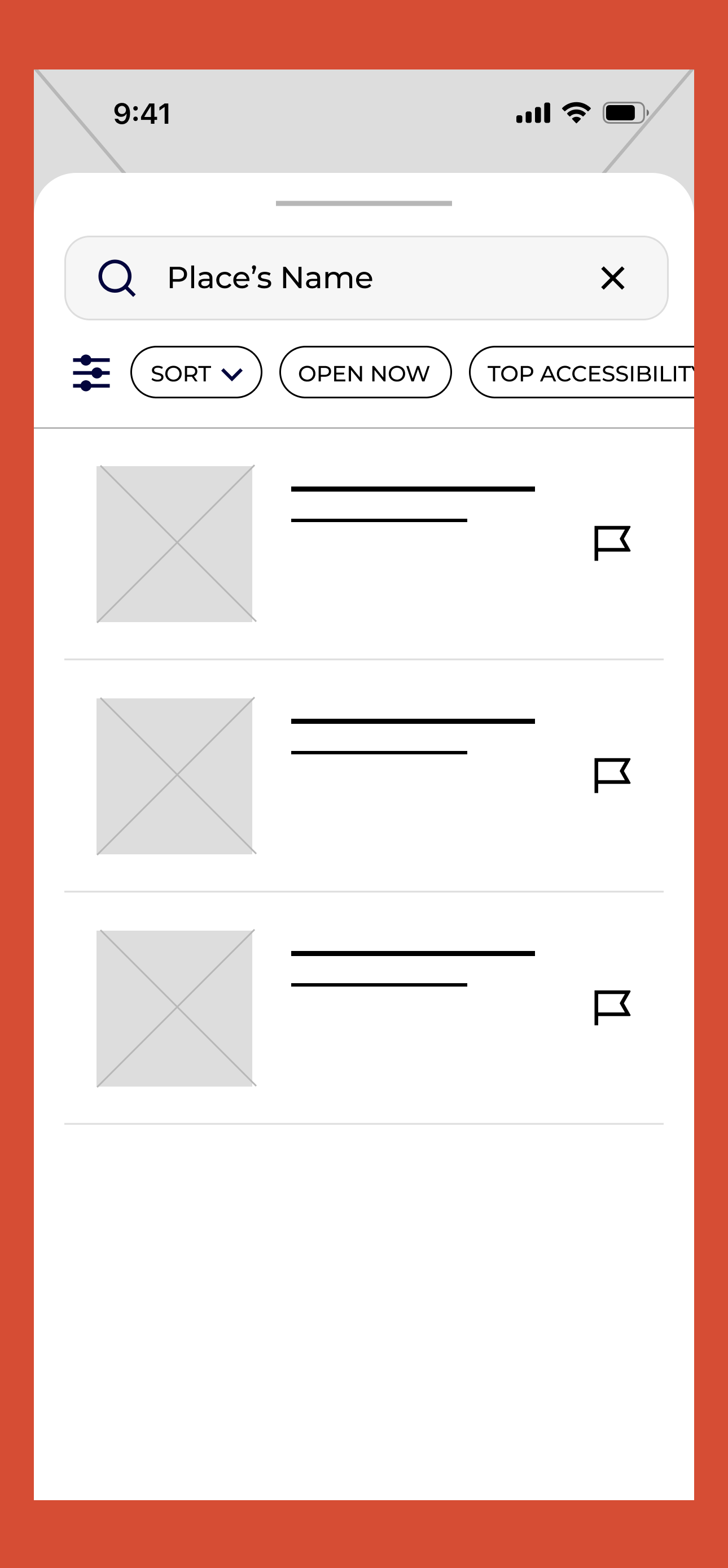
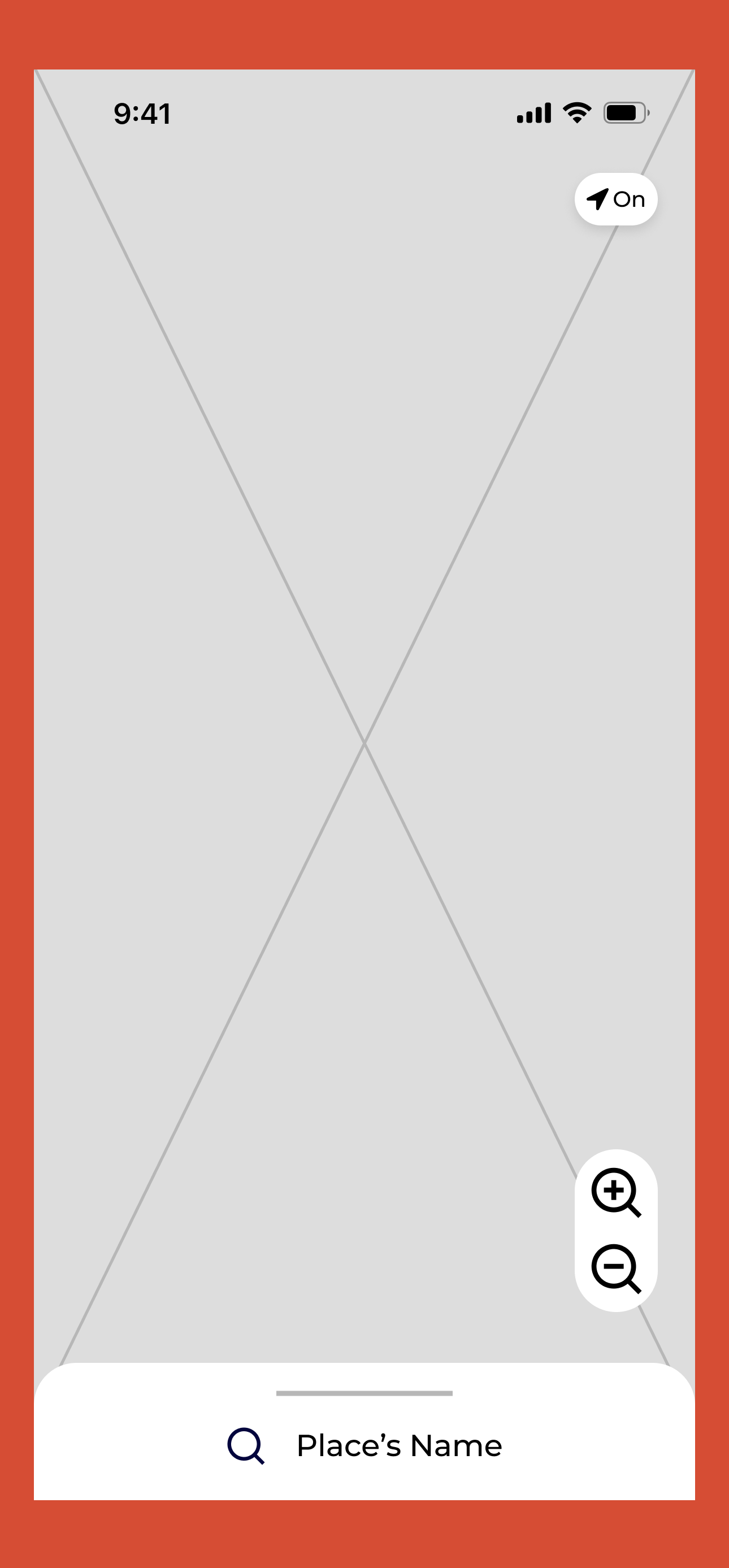
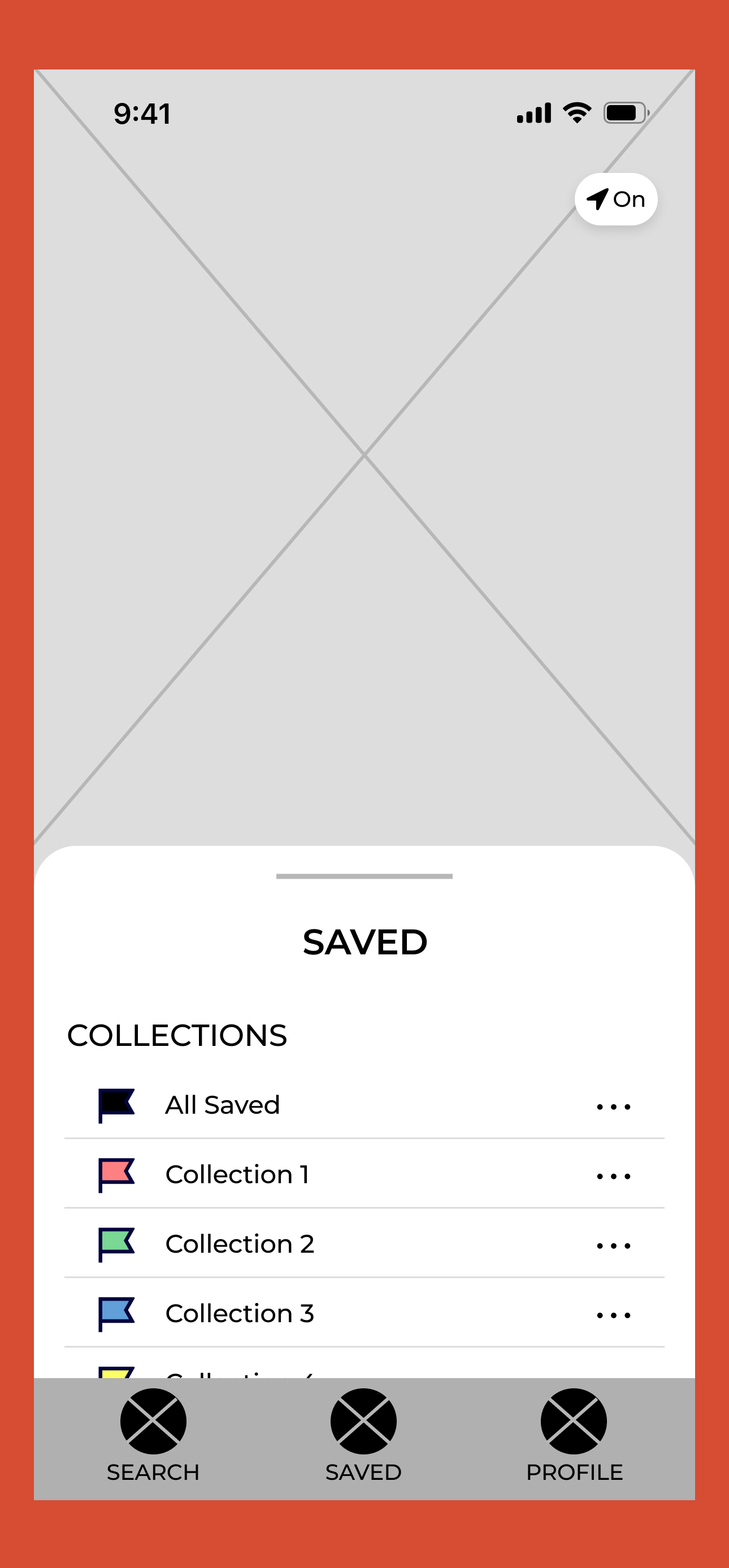
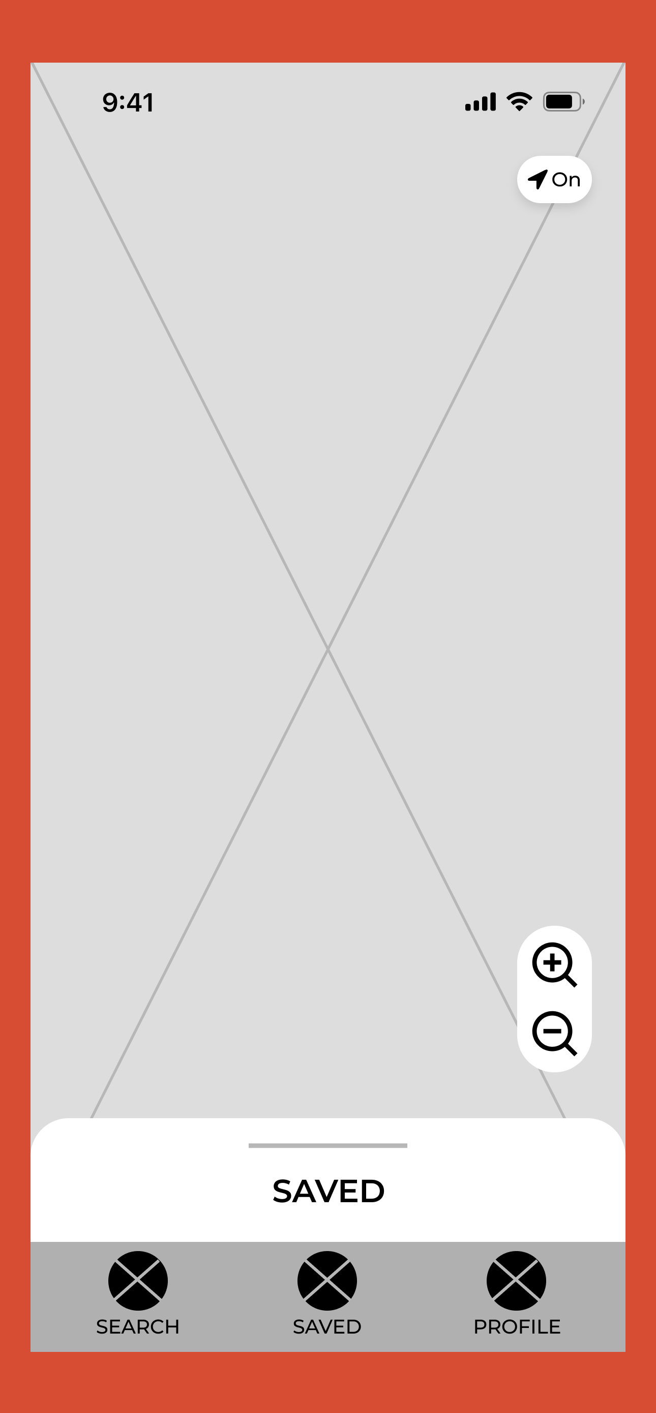
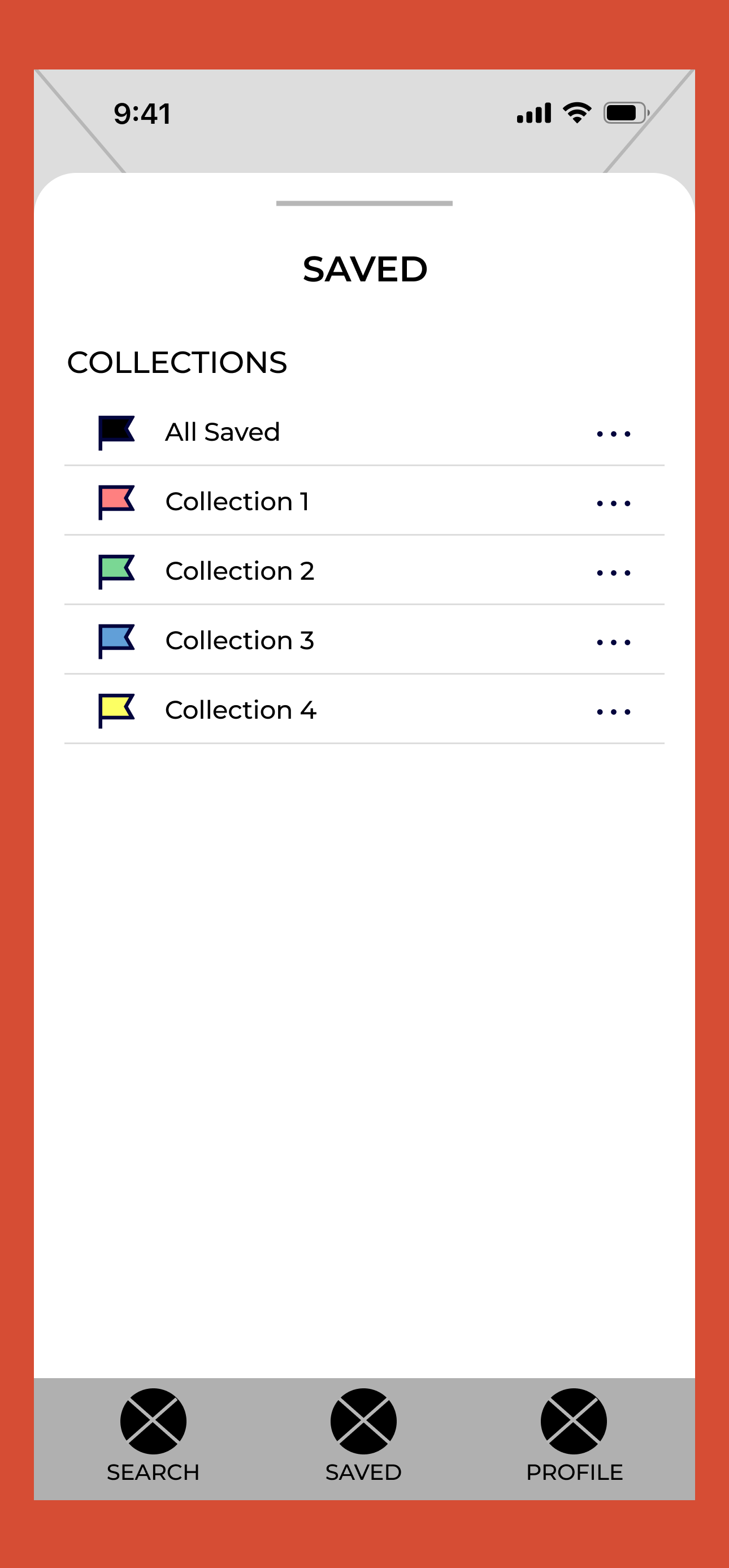
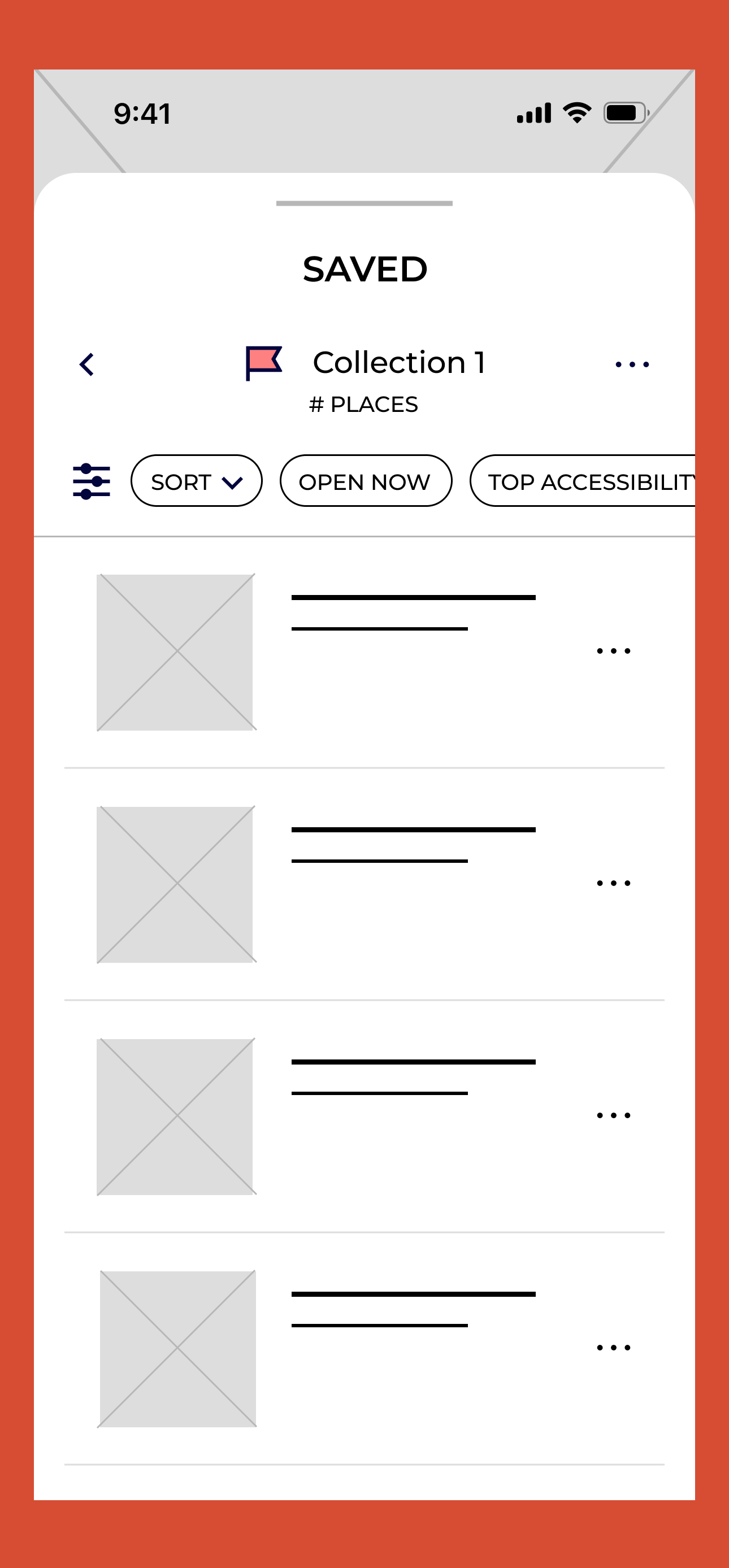
Click image to view file of all the mobile wireframes
Tablet Wireframes:
Click image to view file of all the tablet wireframes
Web Wireframes:
Click image to view file of all the desktop wireframes
User Insights
From the user tests conducted with a working prototype, some of the insights I gathered was:
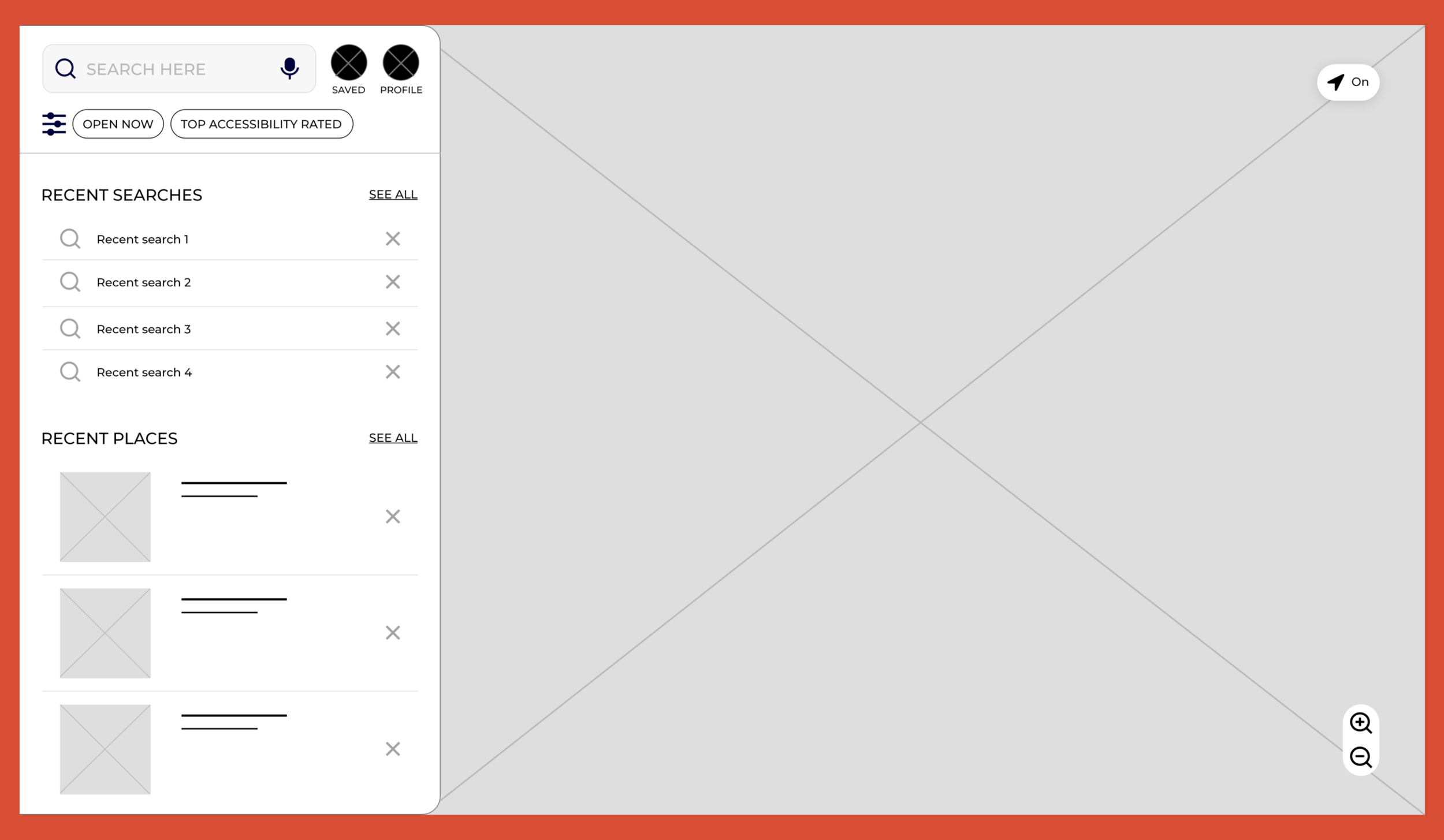
3/5 users want to be able to view nearby parking and public transit stations on the map in order to make it less stressful to figure out travel plans.
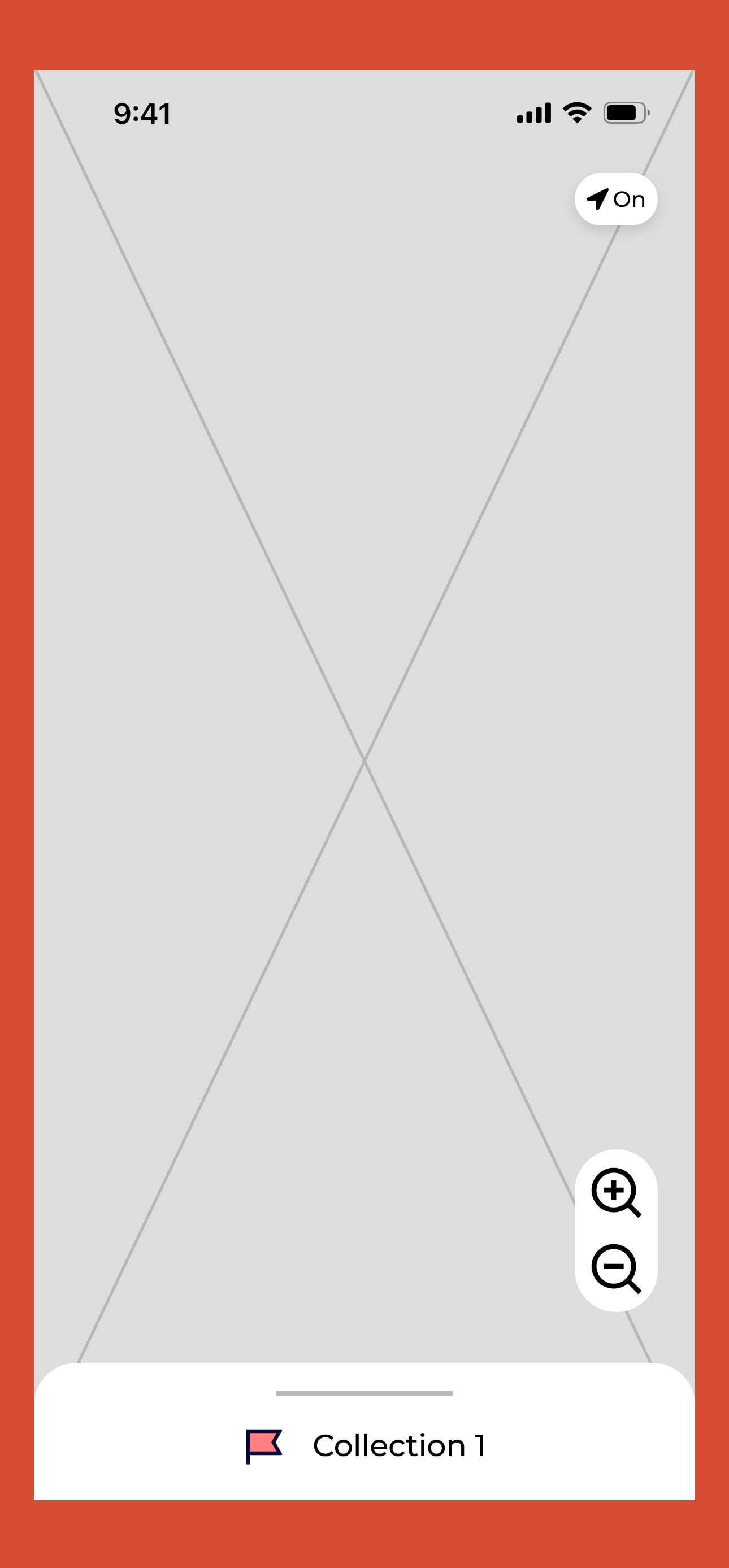
ACTION: Layers option on the map was included to allow users to view locations of nearby parking and public transit.
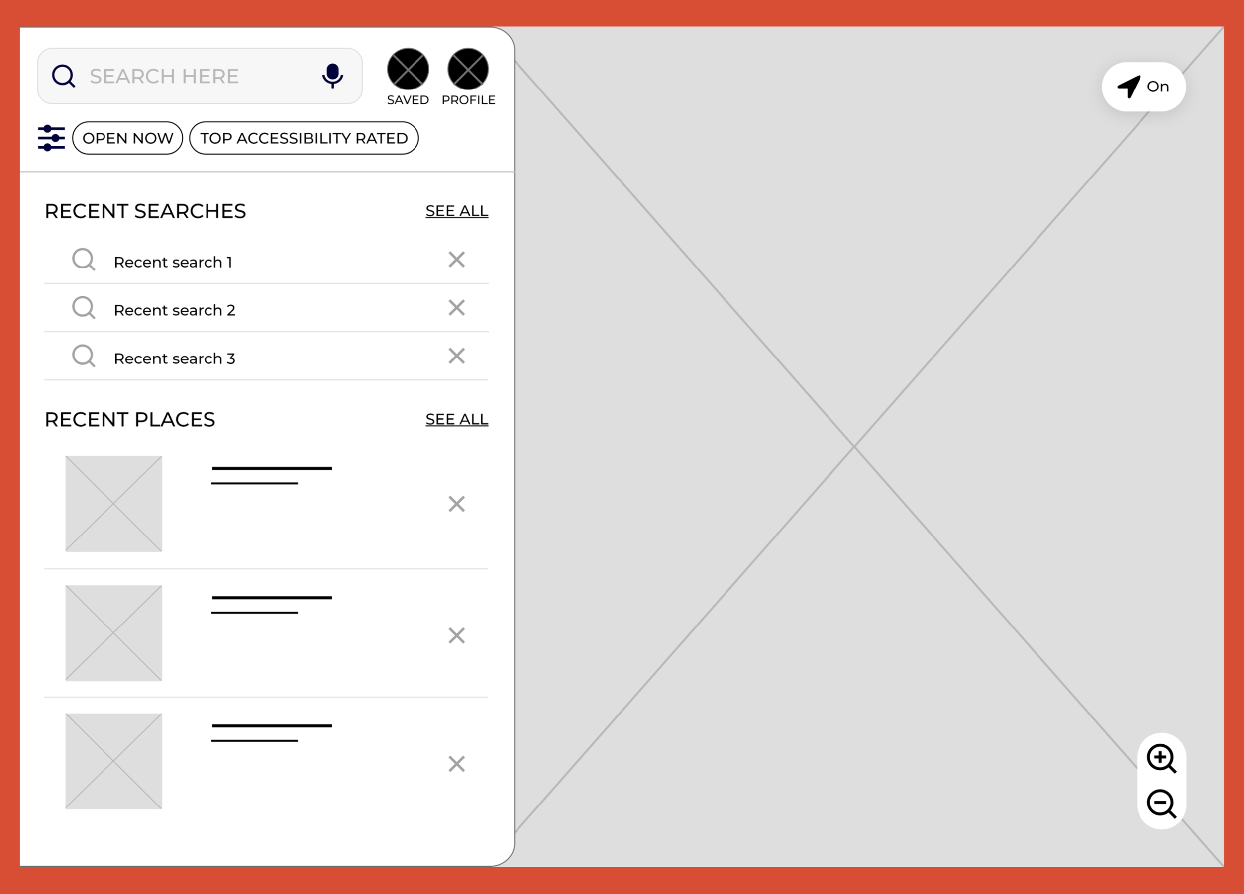
1 user mentioned that the fully capitalized words made them feel slightly agitated.
ACTION: Fully capitalized words became standard, and 5/5 users preferred the change.
4/5 users were frustrated having to manually go to another resource for directions if they found a restaurant they wanted to visit.
ACTION: Given that there are already major resources for directions, a directions button was added which will relocate the user to their preferred directions resource with the restaurant pulled up. This provides users the comfort of not having to learn a new navigation system.
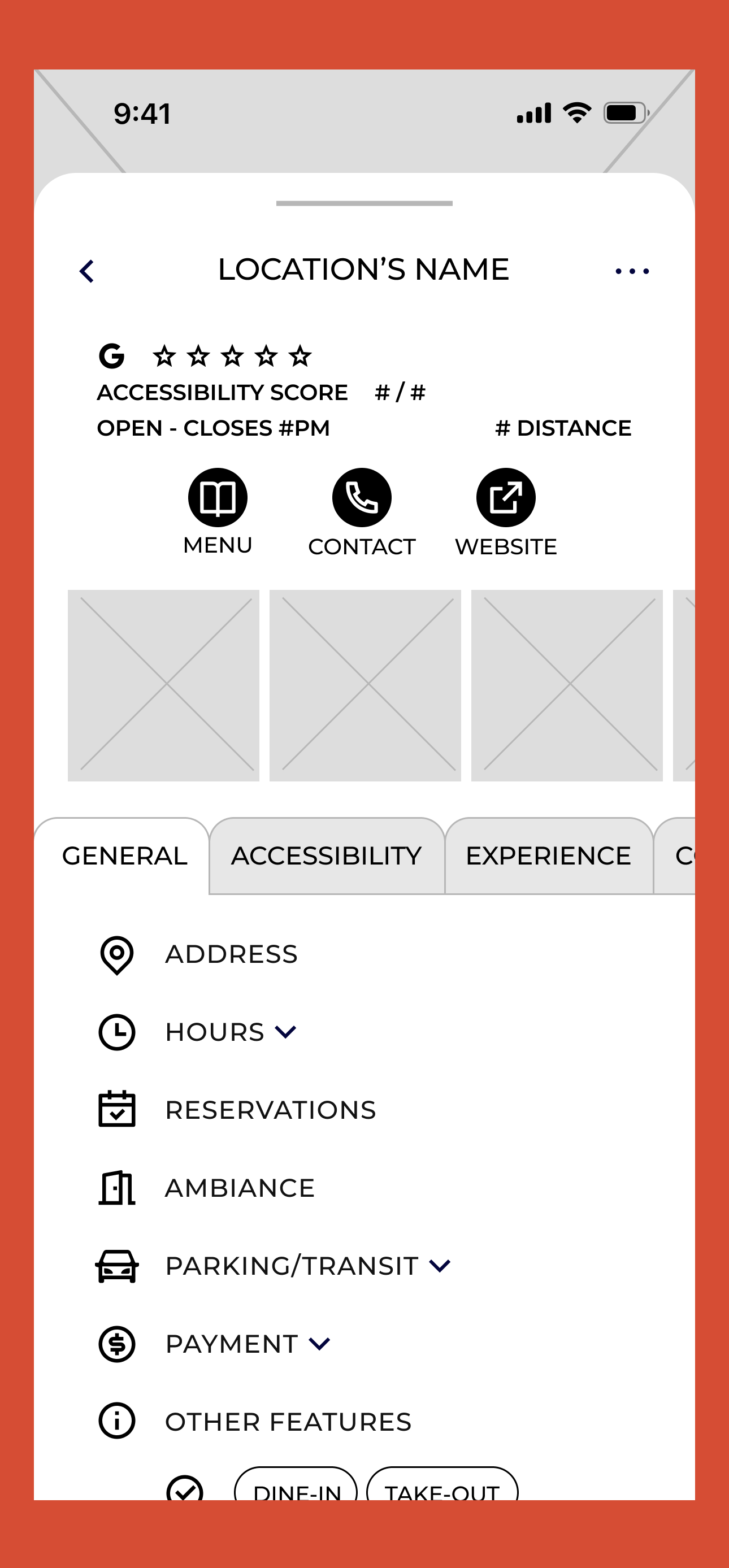
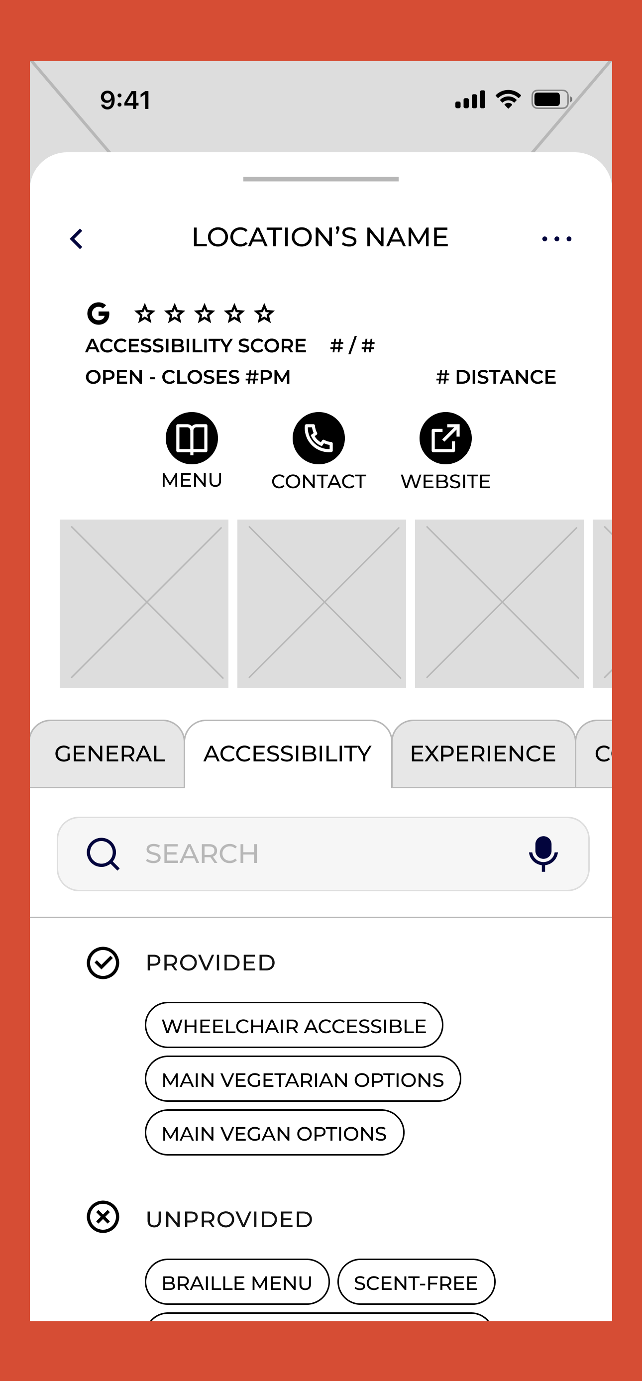
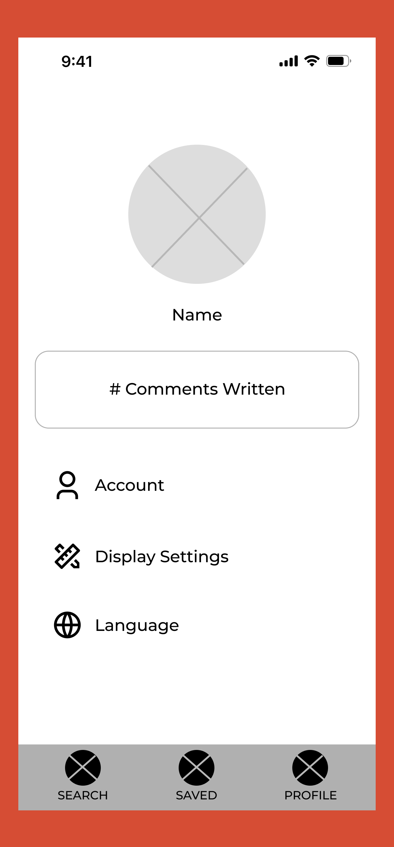
Hi-Fi Screen Design
To avoid having to condense/remove features from the desktop to mobile design and because Provisions would be more convenient as a mobile app, I first focused on finalizing the mobile screen design. Below are some of the high-fidelity screen designs I created.
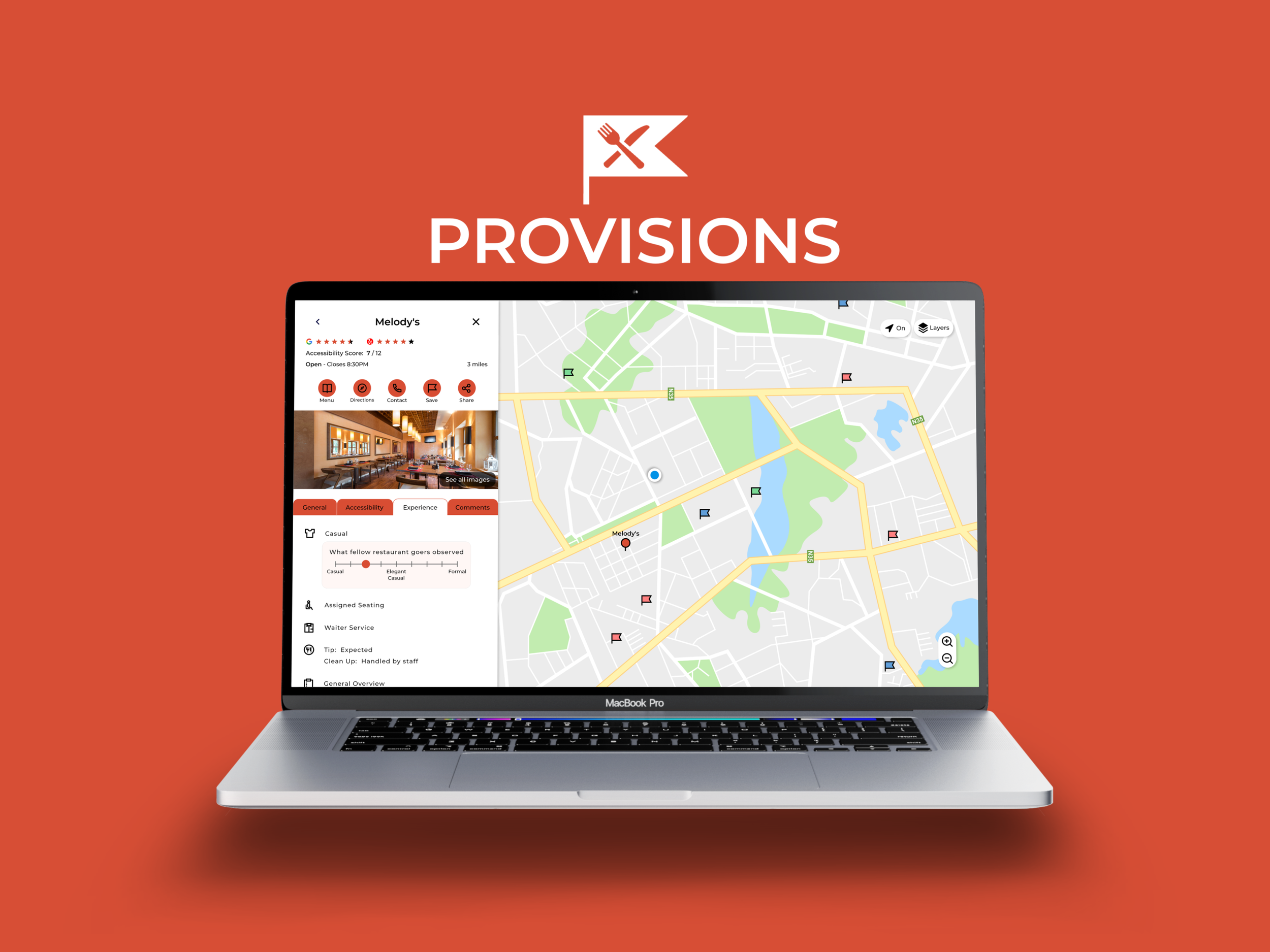
Final Design
I had yet to create a desktop prototype, so I made the final deliverable be for a desktop display to increase my knowledge on how to make the user experience enjoyable across different devices. I hope you enjoy the final prototype!
Highlights
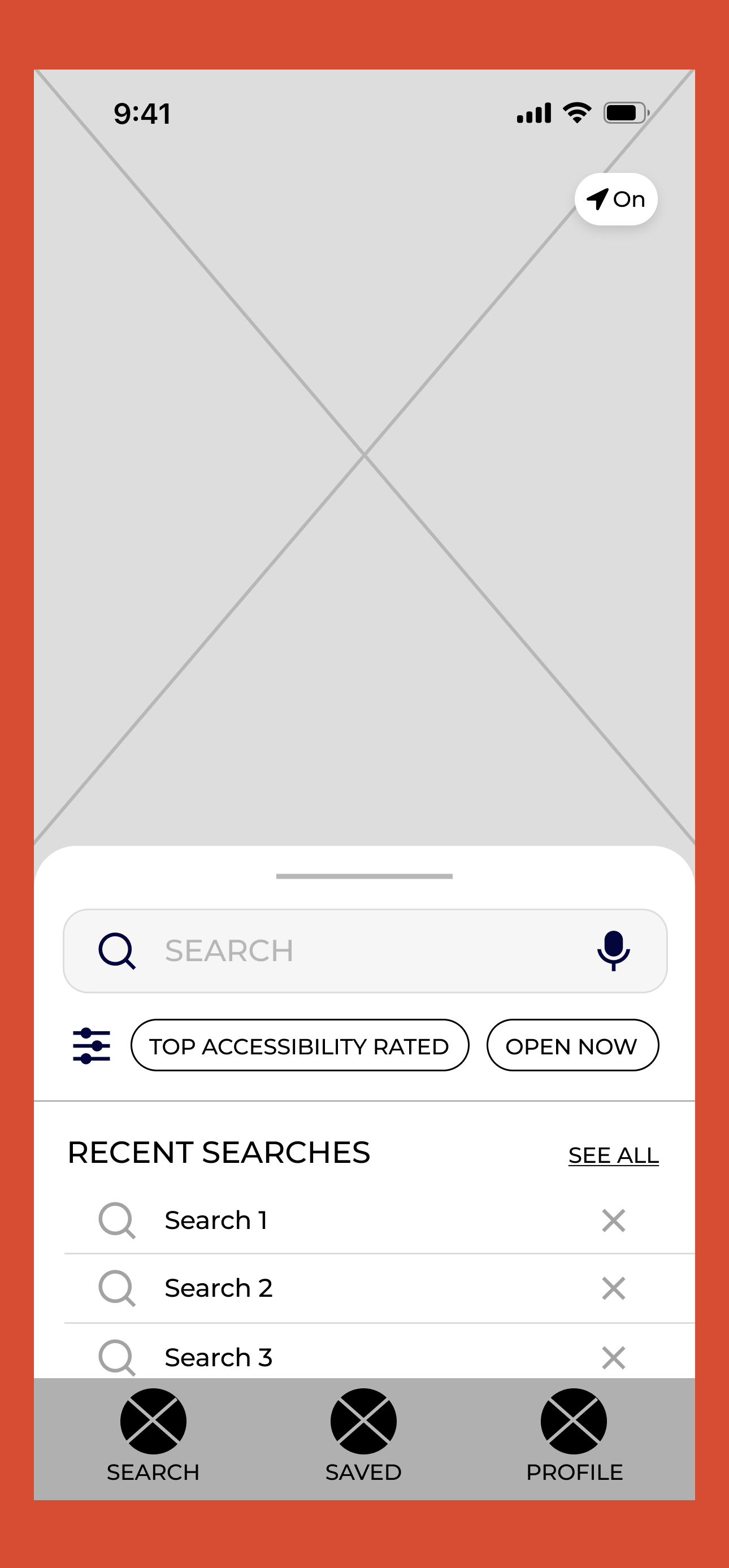
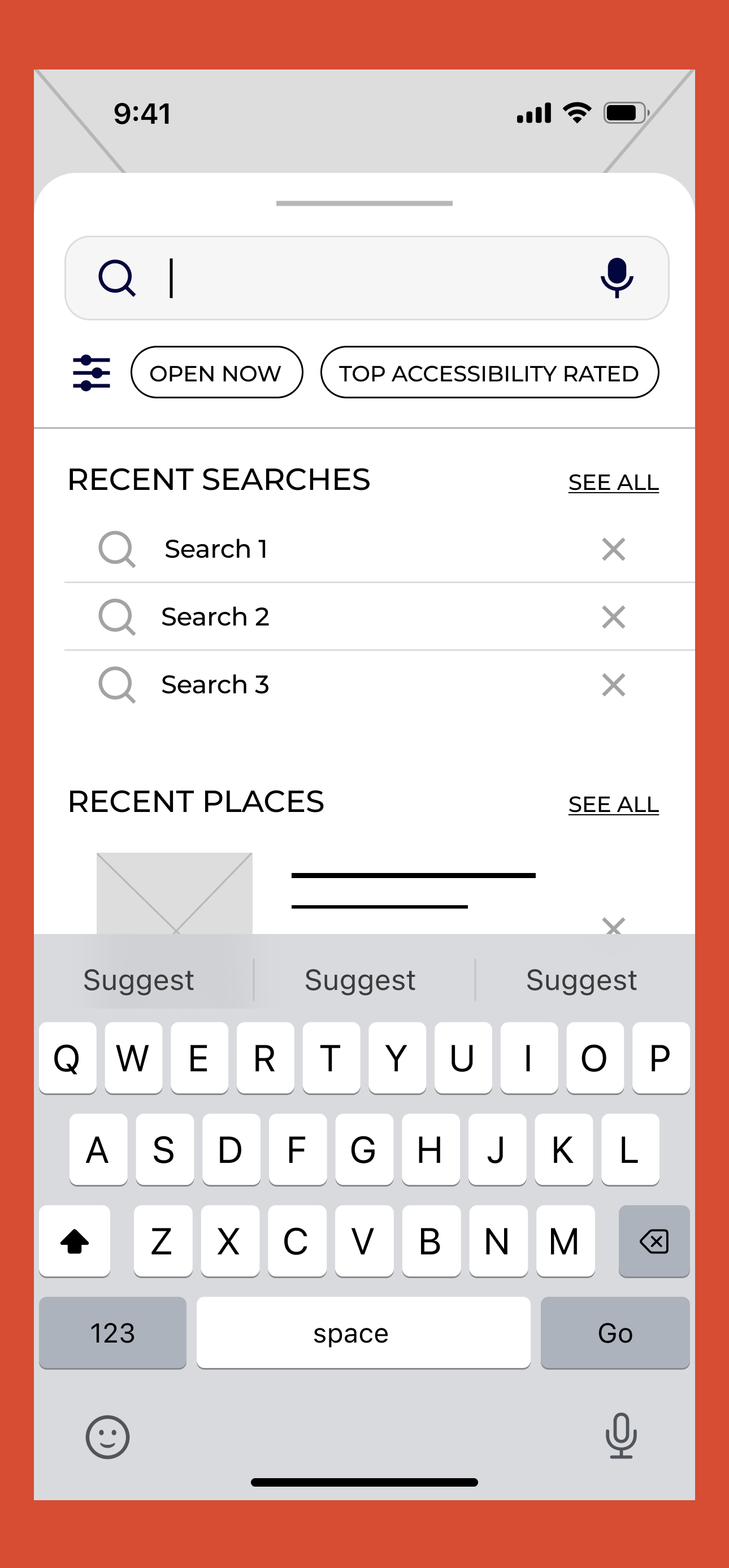
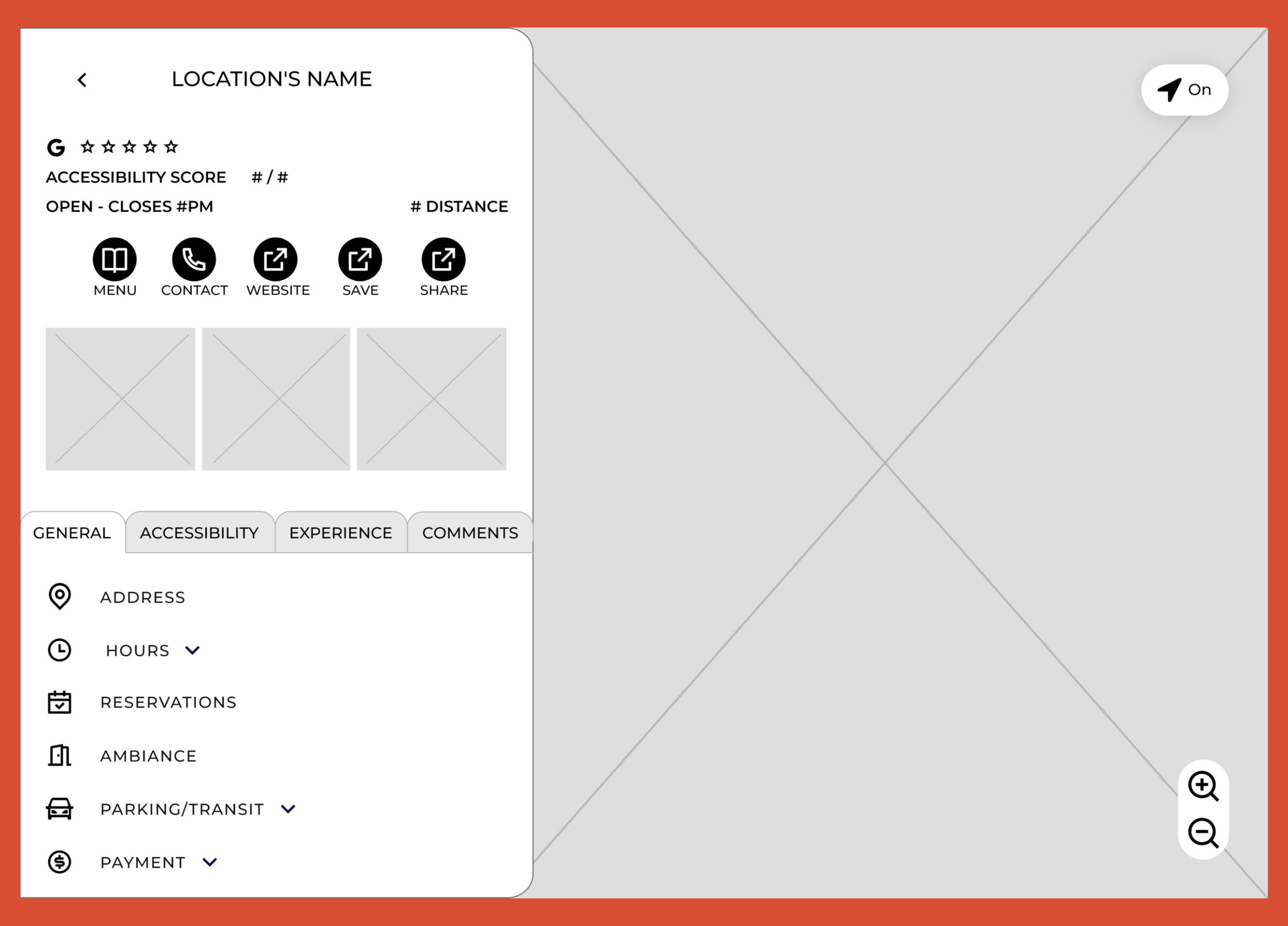
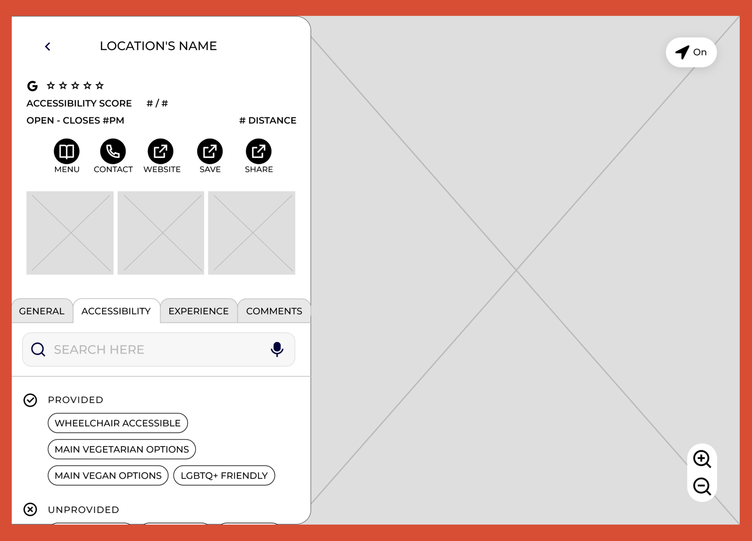
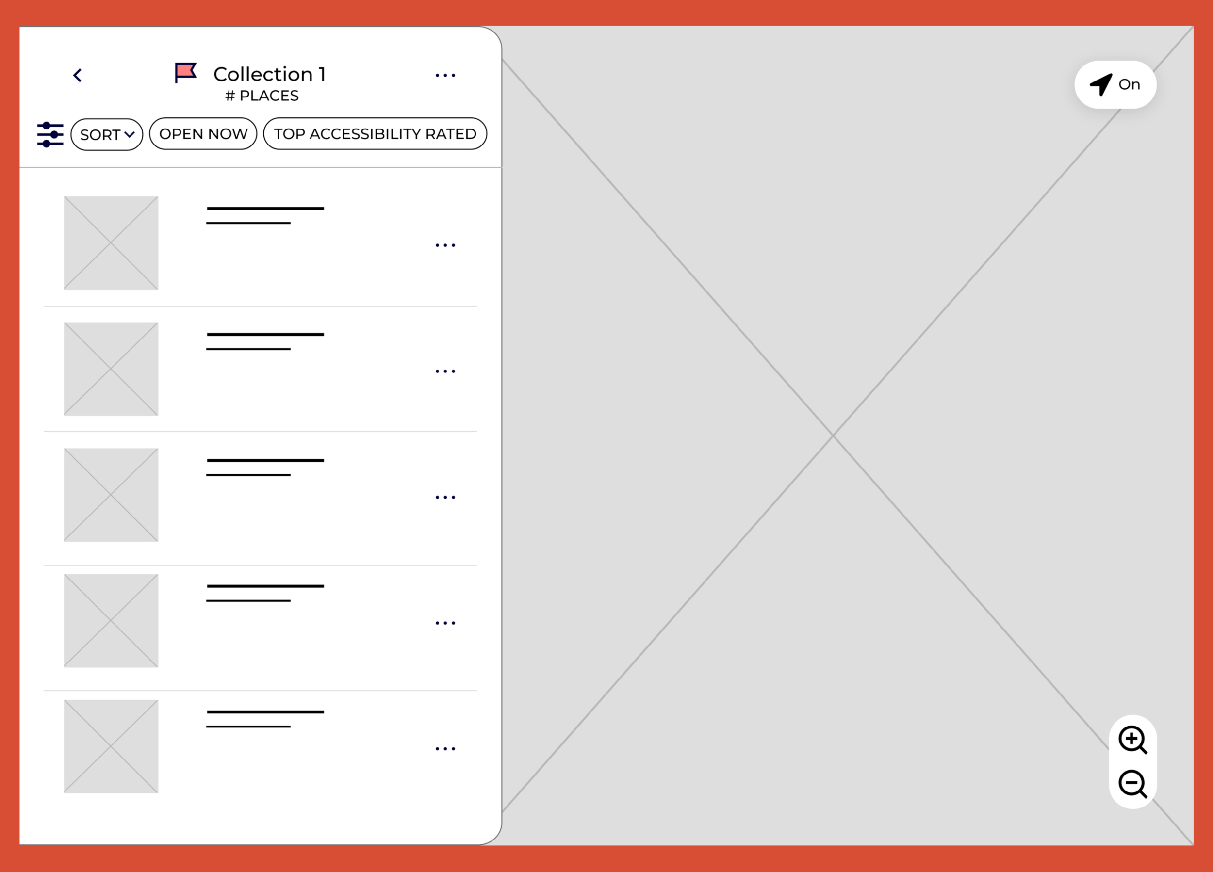
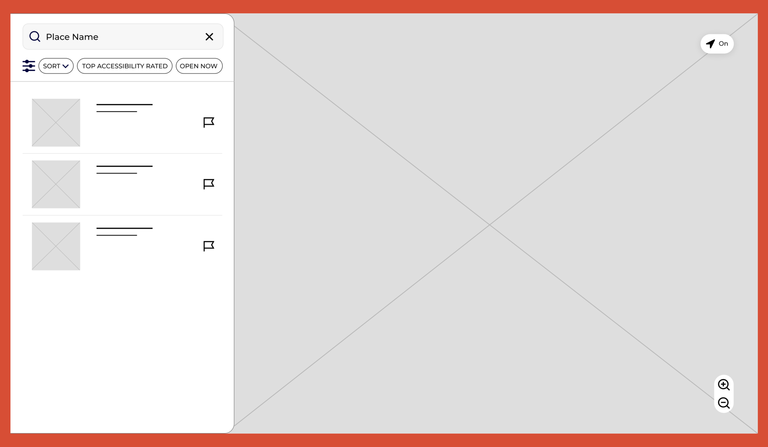
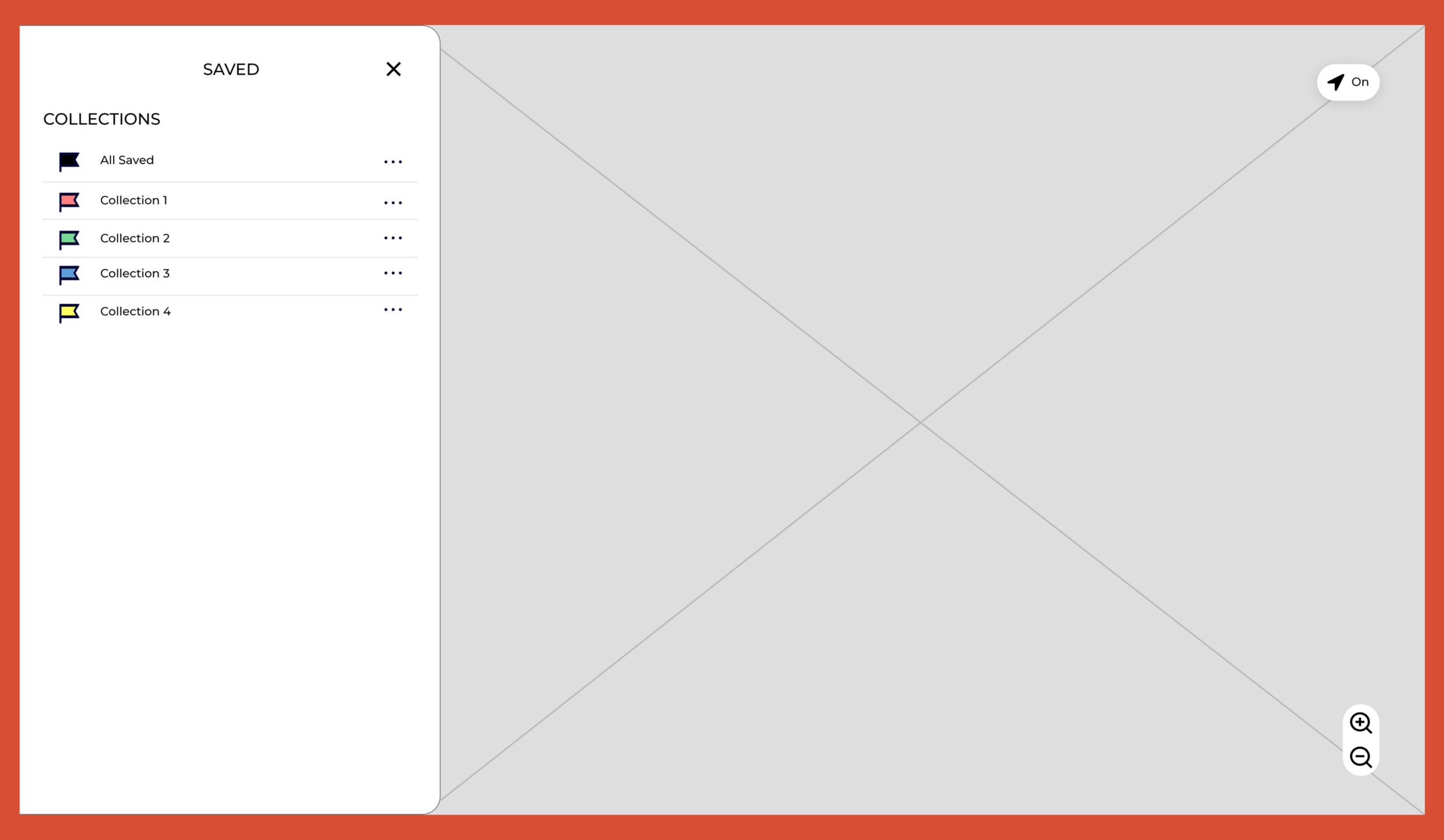
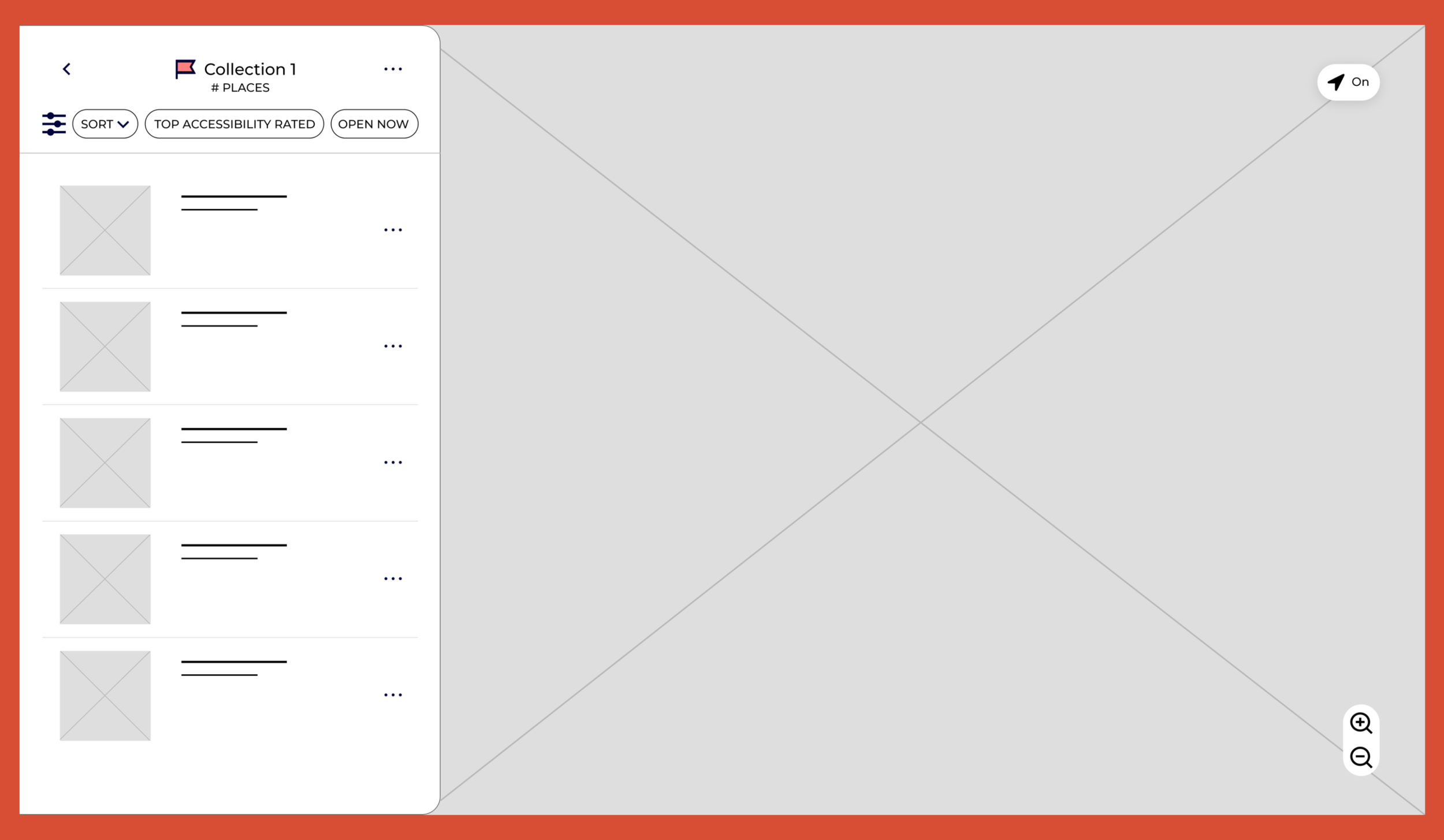
Landing Page
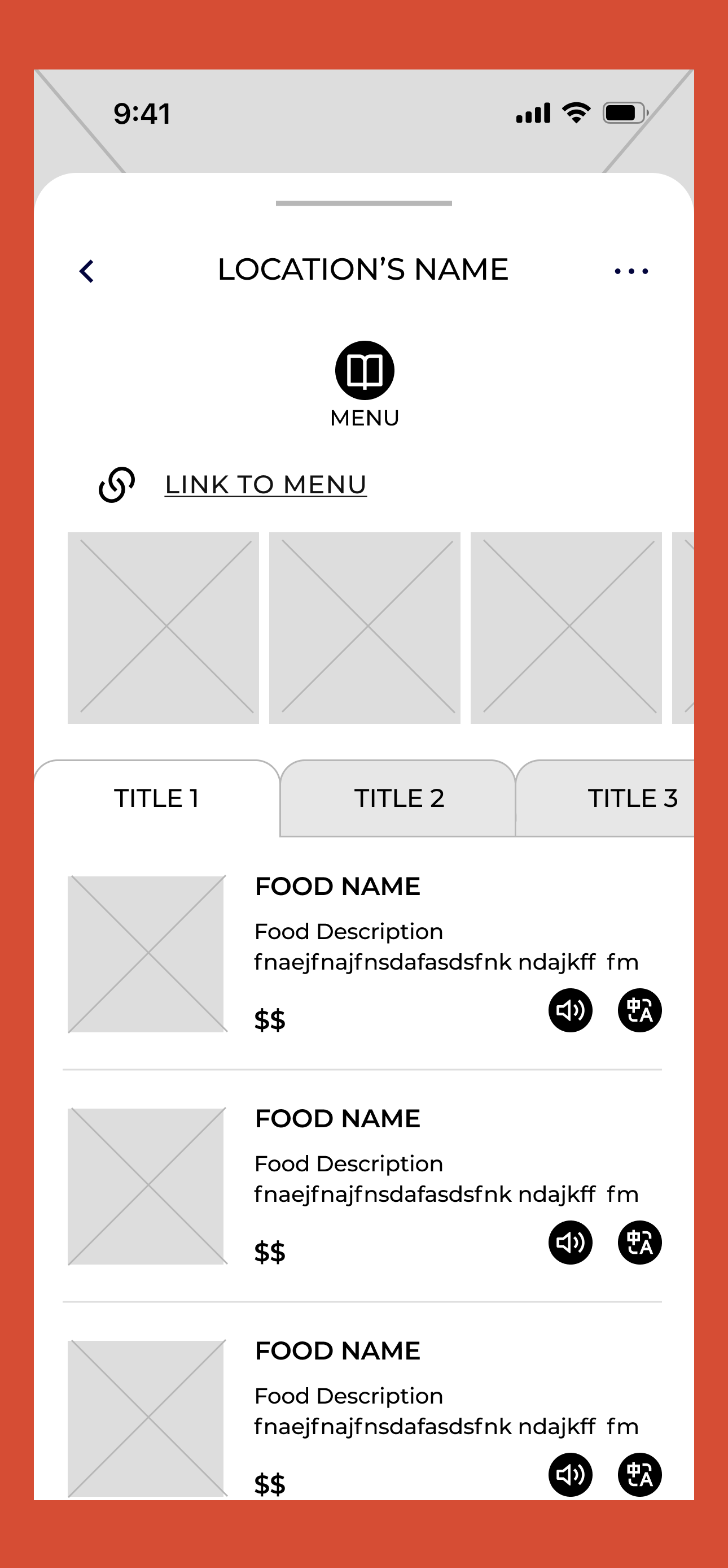
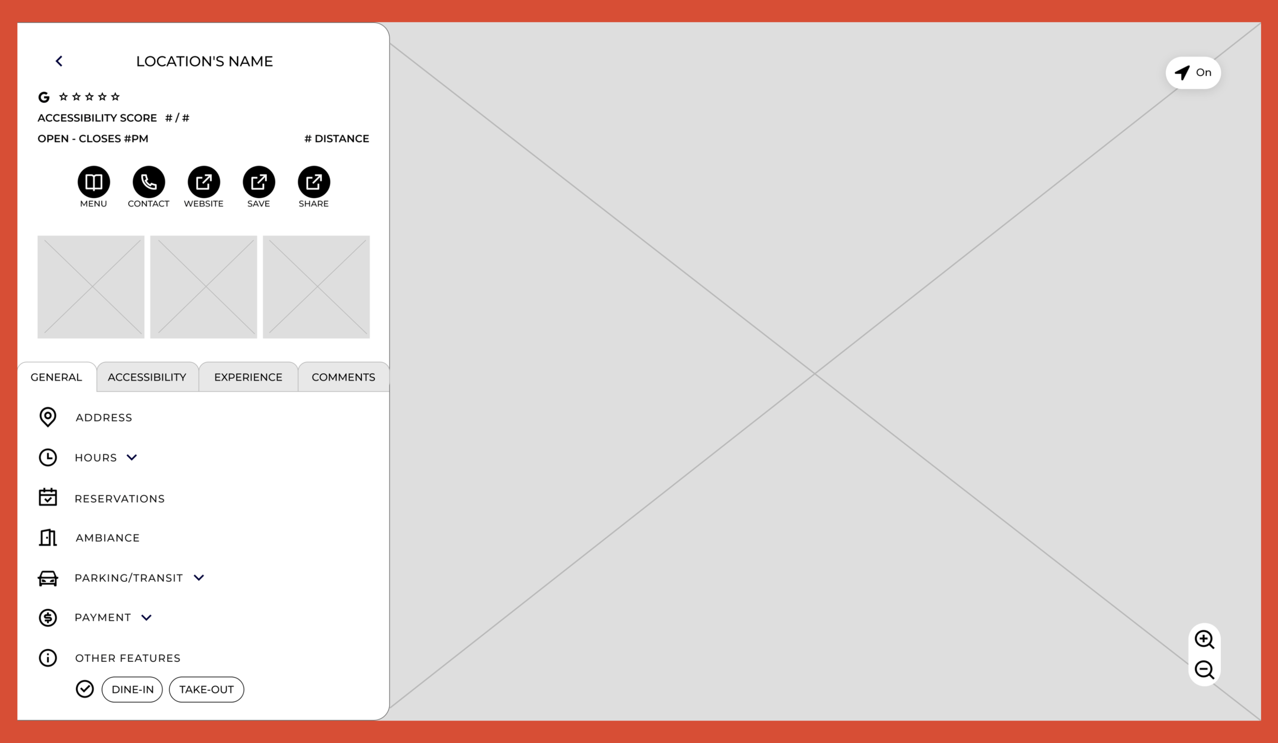
Restaurant Content Page
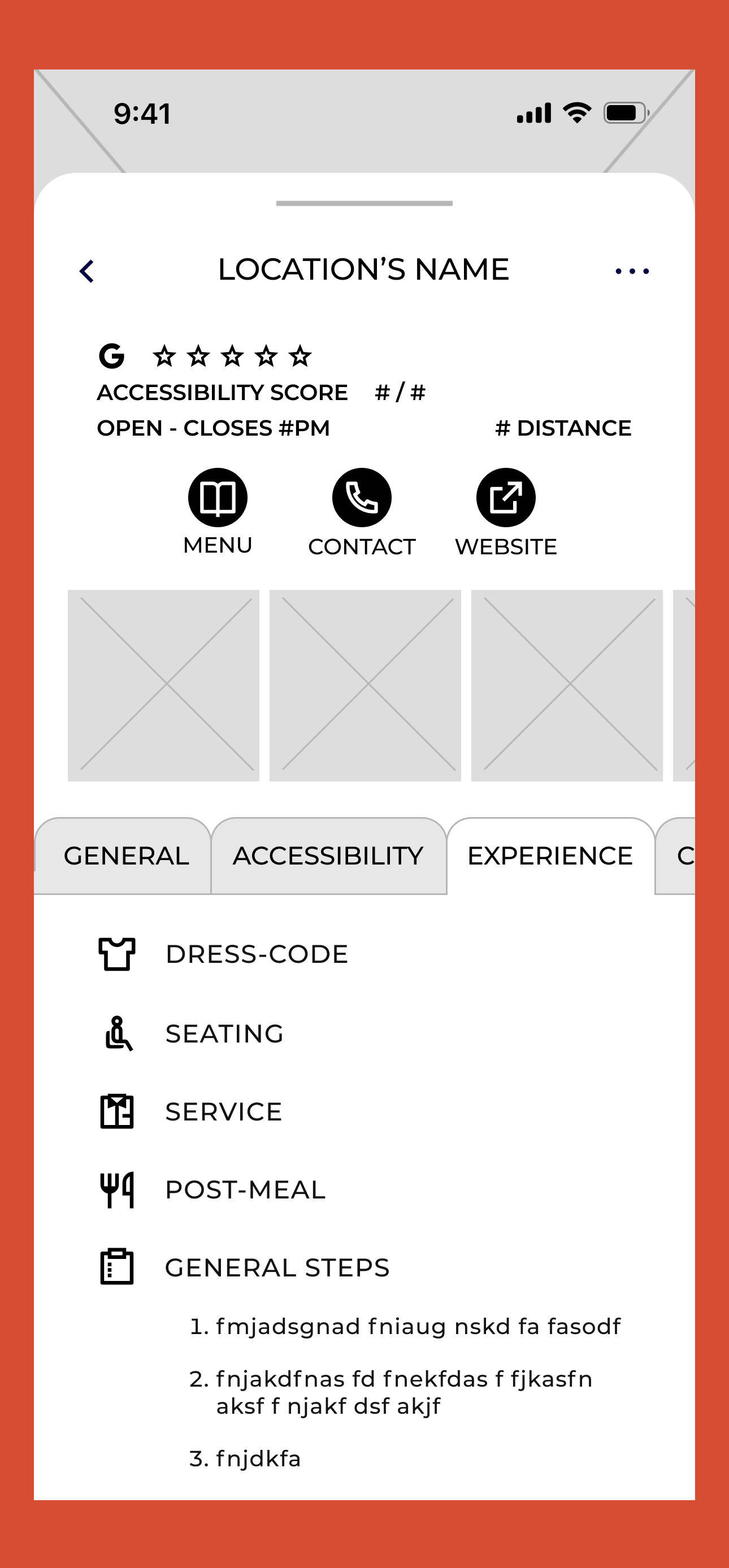
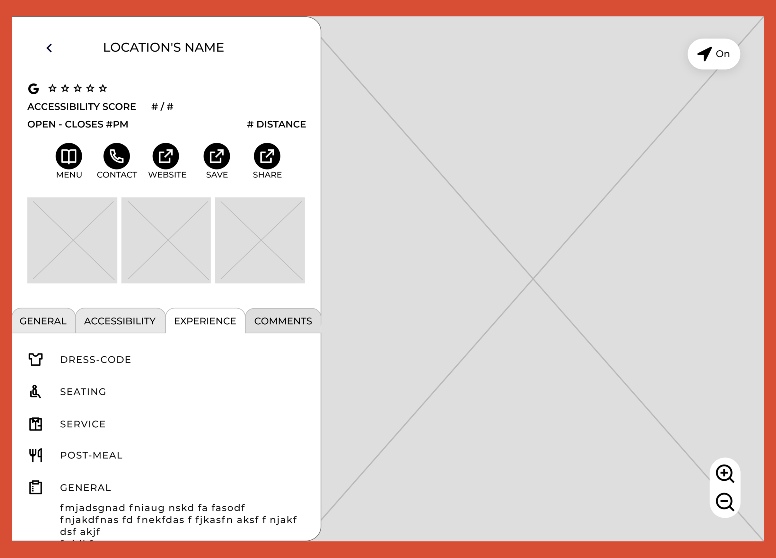
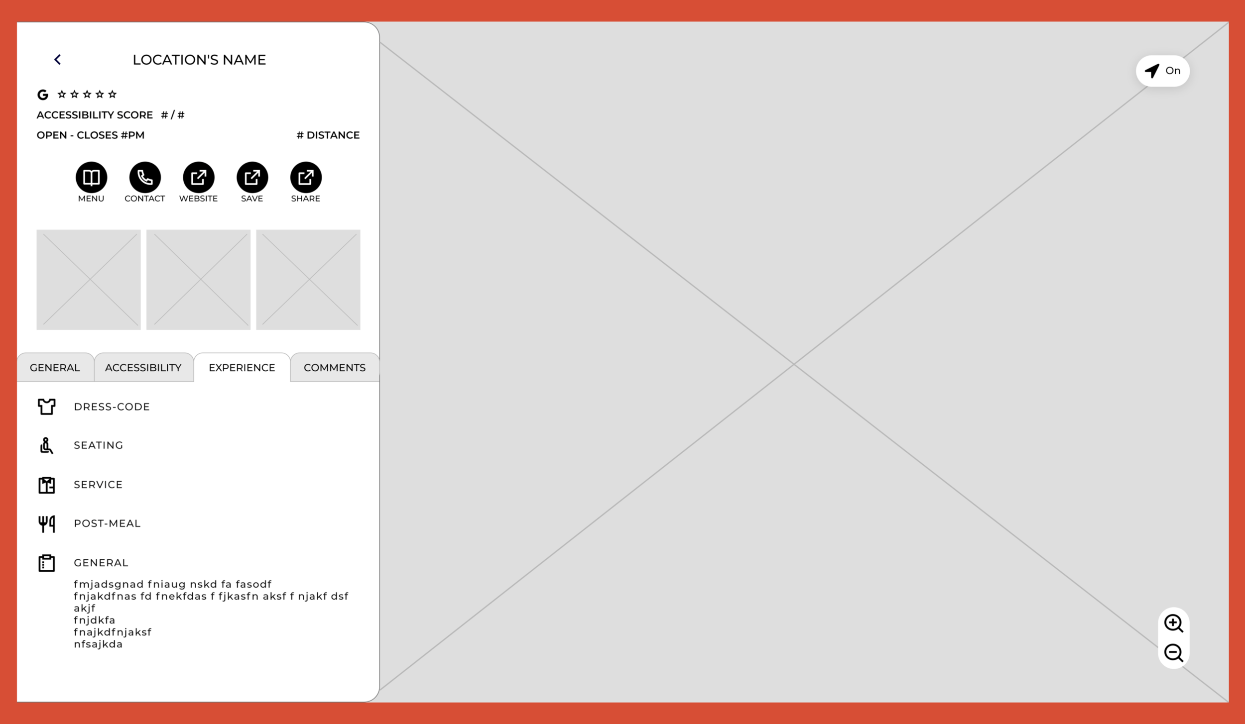
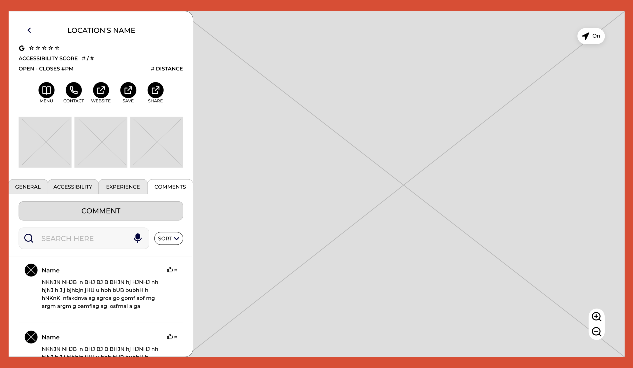
Restaurant Content Page - Experience
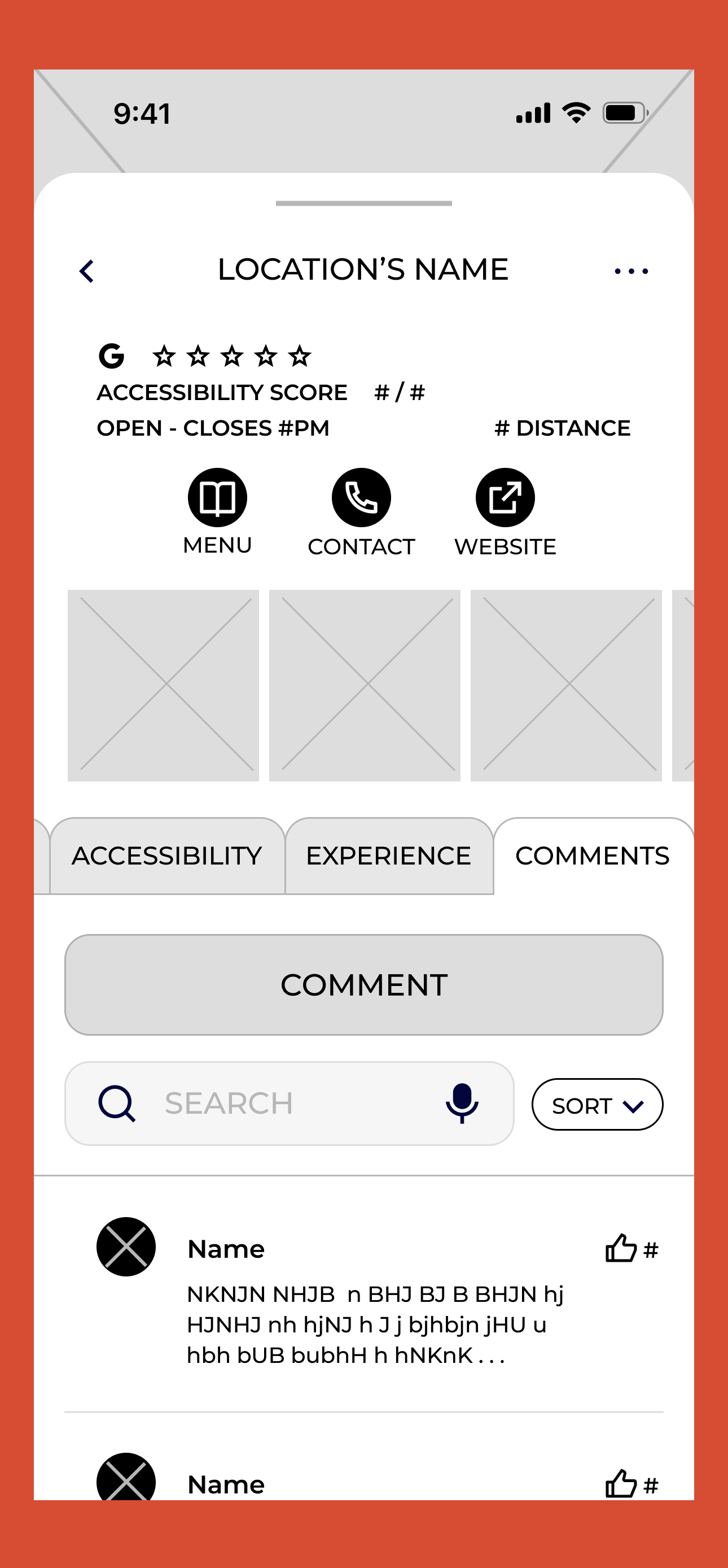
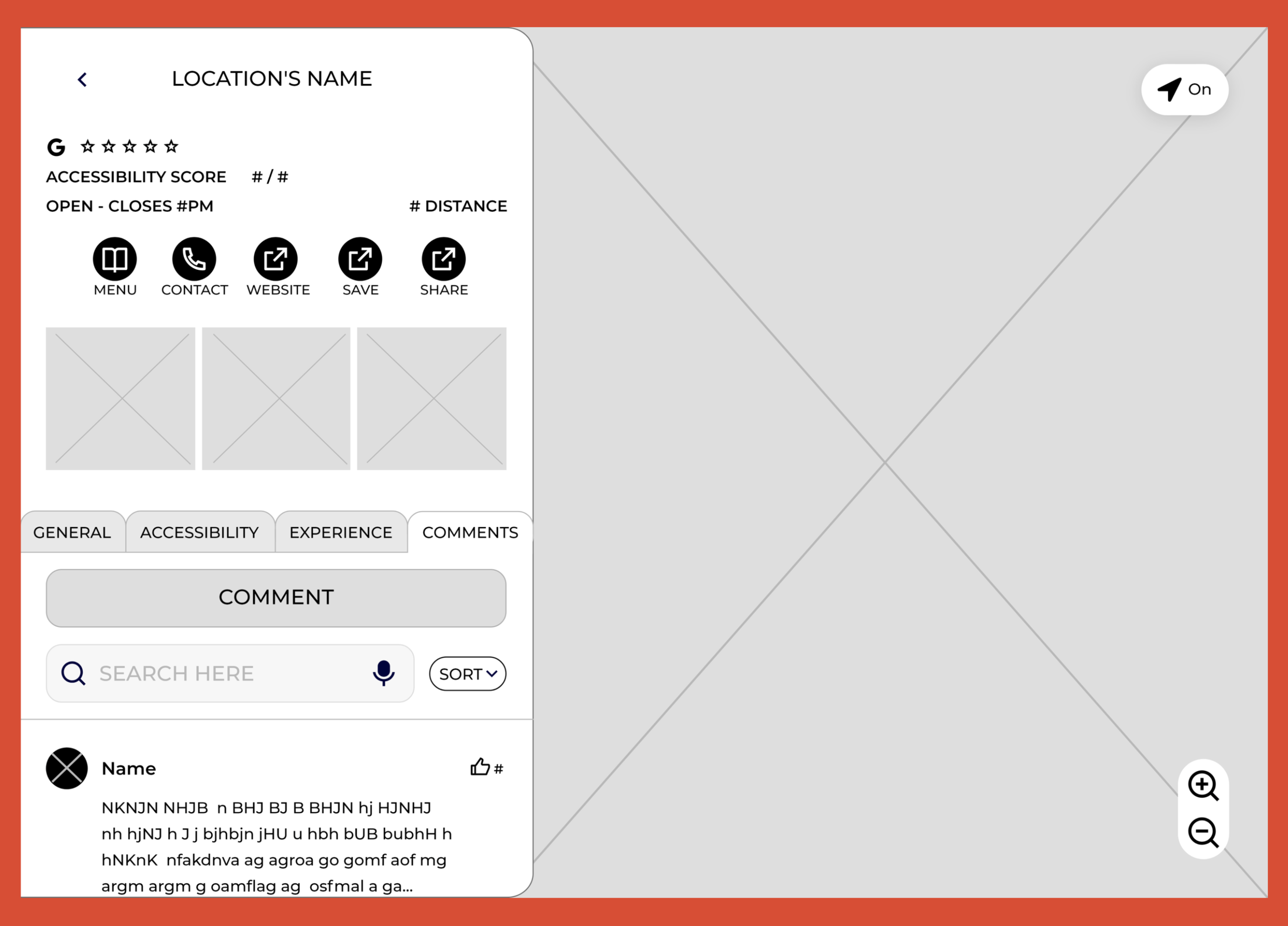
Restaurant Content Page - Comments
Reflection
Next Steps
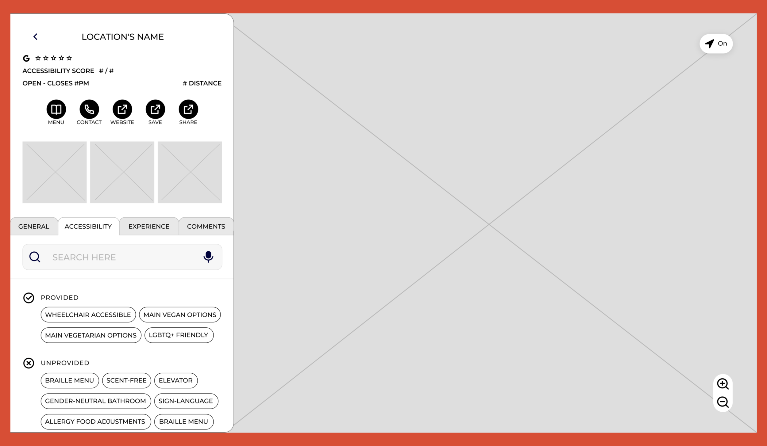
Increase accessibility features: Provisions currently lacks information on restaurant accessibility. To address this, I would increase my user study group to include more people with disabilities to gain more insight into their needs and wants. I would then design prototypes to be user tested and see what additions/adjustments to make Provisions benefit the disability community as much as possible.
Broaden menu feature: I would like to expand the menu feature to include:
all ingredients of each dish with highlights on major allergens so users can know what’s exactly in their food
pronunciation button for each dish to help users be more confident to verbally order
filter option in the menu so users can easily find dishes that match what they are looking for
I would run user tests to see what other features and adjustments to make the menu feature helpful to the user.
Takeaways
Consistency is key: I noticed how small visual changes between device displays can create a major shift in the user flow when a user switches to a different device. From this observation, I became more conscious of my design choices, making sure screen designs on different displays were as similar as possible.
Joy in increasing my toolbox: In designing Provisions, having been more familiar with Figma, I often used it to quickly make digital sketches and complete its more sophisticated version on Adobe XD. In this process, my confidence in using Adobe XD grew and I can now efficiently utilize it. This did not only increased my design toolbox but was also a fun experience of learning something new and seeing myself grow along the way.