
Design Challenges
A couple of challenges I’ve done for previous interviews: UX/UI & Graphic Design
Telehealth - UX/UI Mini Case Study
Time Frame
9 hours
Assignment
Create user interfaces seen by a doctor and their patient during a video visit. The main descriptors of the users are:
Dr. Theresa Washington
is familiar with electronic medical records but only recently started doing telemedicine
uses computers often for work, so she likes to unplug in her free time
Michael Atwell
65-years-old and diagnosed with hypertension
uses Zoom and Facetime regulary to contact friends and family
Empathizing With The Users
Considering Michael and Dr. Washington’s perspectives, I came up with the following points to keep in mind:
Michael Atwell
Older user
easy to read content for comfort, less eye strain, non-overwhelming experience
No a tech expert
include familiar/commonly used UI (IOS, Zoom, Google)
Dr. Teresa Washington, M.D.
Recently doing telemedicine
include commonly used video call UI for comfort
Likes to unplug
avoid opening new pages to access content, reducing time finding and closing content in computer use
Ideating/Sketching
While roughly sketching various interfaces, for user flow and visuals, I referenced from commonly used products/UI:
Zoom
Apple IOS (Facetime, Messages, Reminders)
Google Products (Gmail, Drive)
Design
The following general visual elements were to reflect the company’s bright, joyful, and whimsical personality and help calm nerves for an upcoming doctor's visit:
Rounded components
soft appearance, rounded corners associated with safety and trust
Purple and white color scheme
white brightens the interface, purple is calming and associated with magic/being playful
Brightly colored elements
makes interface more enjoyable to view
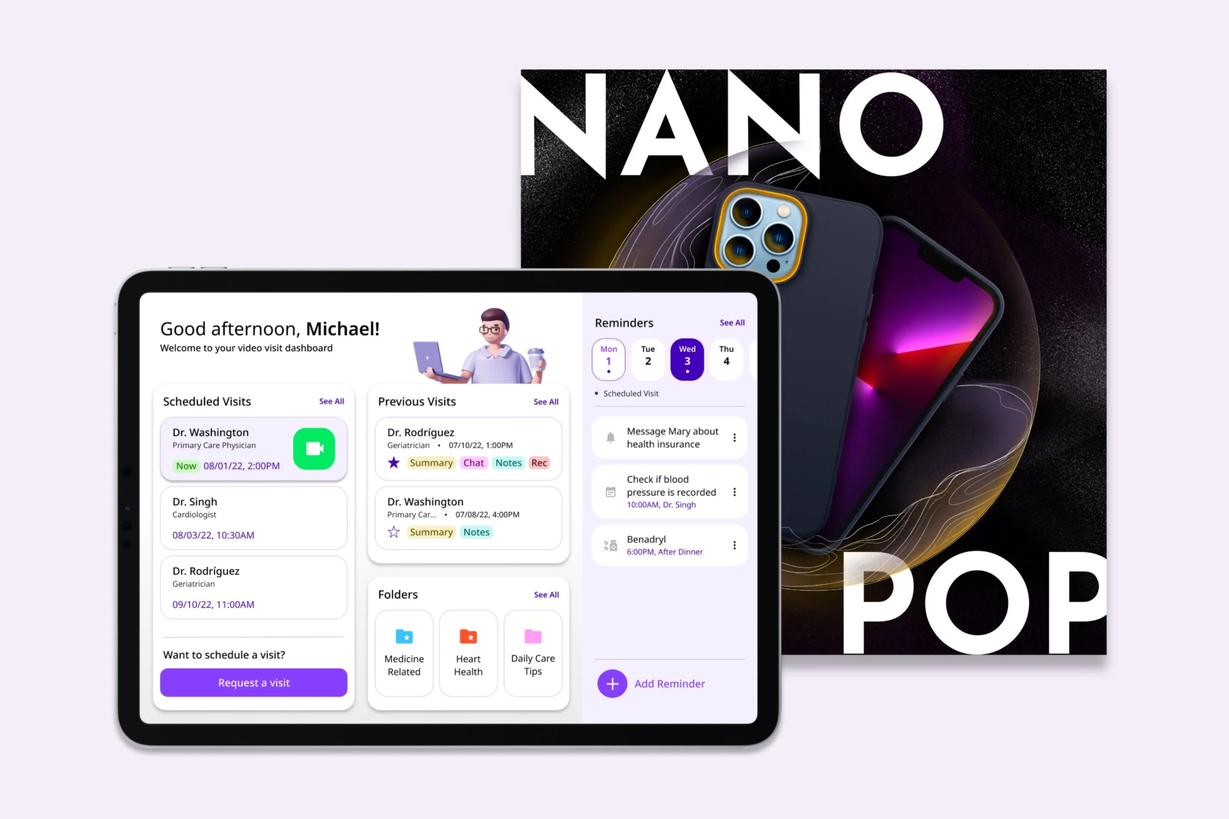
Video Visit Dashboard - Michael / iPad
During Video Visit - Michael / iPad
Adding Reminder - Michael / iPad
During Video Visit - Dr. Washington / PC
Medication Edit - Dr. Washington / PC
Nano Pop iPhone Case - Graphic Design
Time Frame
16 hours
Assignment
Create an announcement post content introducing the new case called Nano Pop with the assets provided and no limitation in style.
Design
I wanted to follow the classic tech aesthetic of being sleek but also playful due to how, in the provided assets, the cases contained fun and bright pops of color. With this in mind, the design went with the following:
Space theme
futuristic and refers to technological advances
the black starry background provides a clean and “shiny” look
Popped bubbles
references to the word “Pop”
a fun way to include additional color to the design to add interest
Different textures
adds interest to the design and can be seen as more playful