
ArtStory
An art museum’s history app to be used remotely and enhance the user’s museum experience | Personal Project
UX UI Design
Research
Usability Testing
Prototyping
Role
UX Designer
Timeline
Mar 2022 - Apr 2022
Tools
Figma
“I enjoy going to art museums, but I find it rather surface level and hard to appreciate when I don’t get it [an artwork].”
Jennifer W., from user interviewsProject Overview
The Challenge & Background
Art museum-goers are often given limited information in the gallery and finding more information online can be inconvenient and hard to navigate, making it harder for people to learn more about an artwork to fully enjoy what the piece has to offer.
Being an active art museum-goer, I realized how much I was missing out on my trips as I took art history courses and soon realized this was common for most people I knew to the point they felt less inclined to got to art museums.
To better understand how to help other art lovers, from casual to intermediate, to be more engaged with artwork, I chose to make this my first UX project where art history content for a museum can be easily accessible and digestible.
The Objective
To keep users stay engaged in art and interested to coming back to their selected museum, or others, even after their venture, I also kept in mind of ArtStory being a resource that users can enjoy at the museum and remotely. To help achieve that and to address the challenge above, I landed on these main goals:
SIMPLE INTERFACE THAT PROMOTES EXPLORING
Casually browse artworks and artists, similar to a newsfeed
See new showings or events happening at their selected museum
EASY ACCESSIBILITY TO BACKGROUND CONTENT
Simple navigation to get to detailed content
Content is easy to parse
ACCESS TO AUDIO GUIDES
Experience an audio tour on your own device on site and remotely
Research
Getting to Know the User
To get a gauge of what our users would find interesting in an art history app, I conducted user interviews with those who enjoy art museums with the goals of:
Understand their points of interest in an art piece
Identify current pain points they experience when finding more background about a piece
Identify features they would find beneficial to an art history app that can useful in the museum and out
Taking into consideration of who I interviewed, I represented them through 2 personas:
What’s Out There Currently?
To set a baseline of what to include in my app design and see what enhancements to include in ArtStory that fit our goal, I analyzed top art history apps of the time (2022). In general, all the three apps are focused on exposing the user to new artwork and learn more background.
To see how these apps are utilized and first impressions, I had the users I interviewed interact with these apps leading to the following findings:
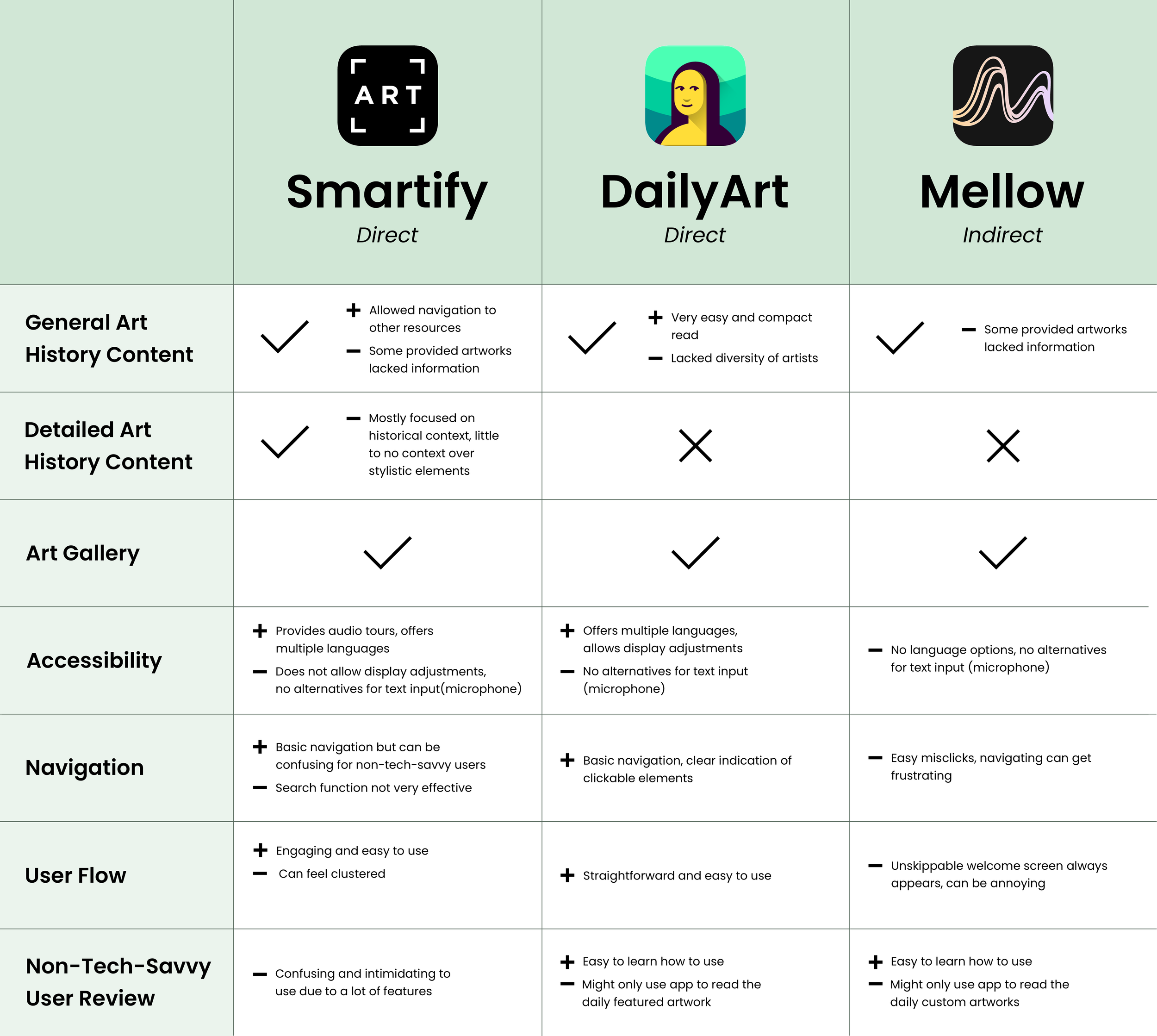
PAIN POINTS
Lacked diversity in content, where some artworks only had a basic overview so it was less engaging to some users
Was confusing to navigate around for non-tech-savvy users, making them less inclined to use the app
No option for microphone use to input text, so it took users that have difficulties with typing on their phone longer search around
Little to no audio options in major text portions, taking away time from the user to look artwork and engage with the content at the same time
Design, Test, and Repeat
Ideating
Taking from the research conducted, the following features were prioritized:
Quick ways to find an artwork’s content: allow users to easily locate art history content that fit different workflows
Option to see more detailed content: users can go beyond the general info and not be overloaded with all detailed information at once
Section out content: have content be more readable and less overwhelming
Incorporate accessibility features: additional abilities to learn about an artwork more conveniently
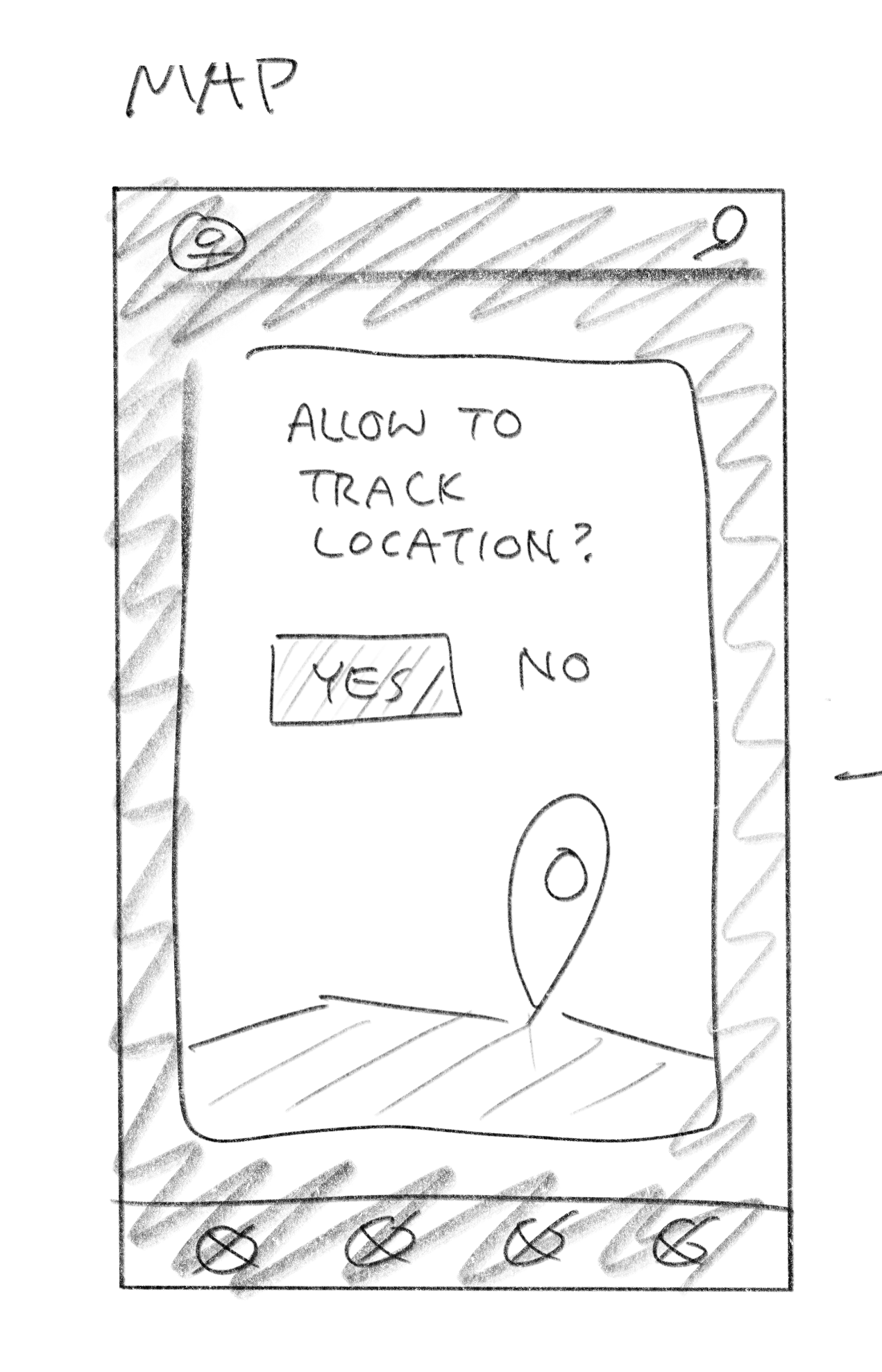
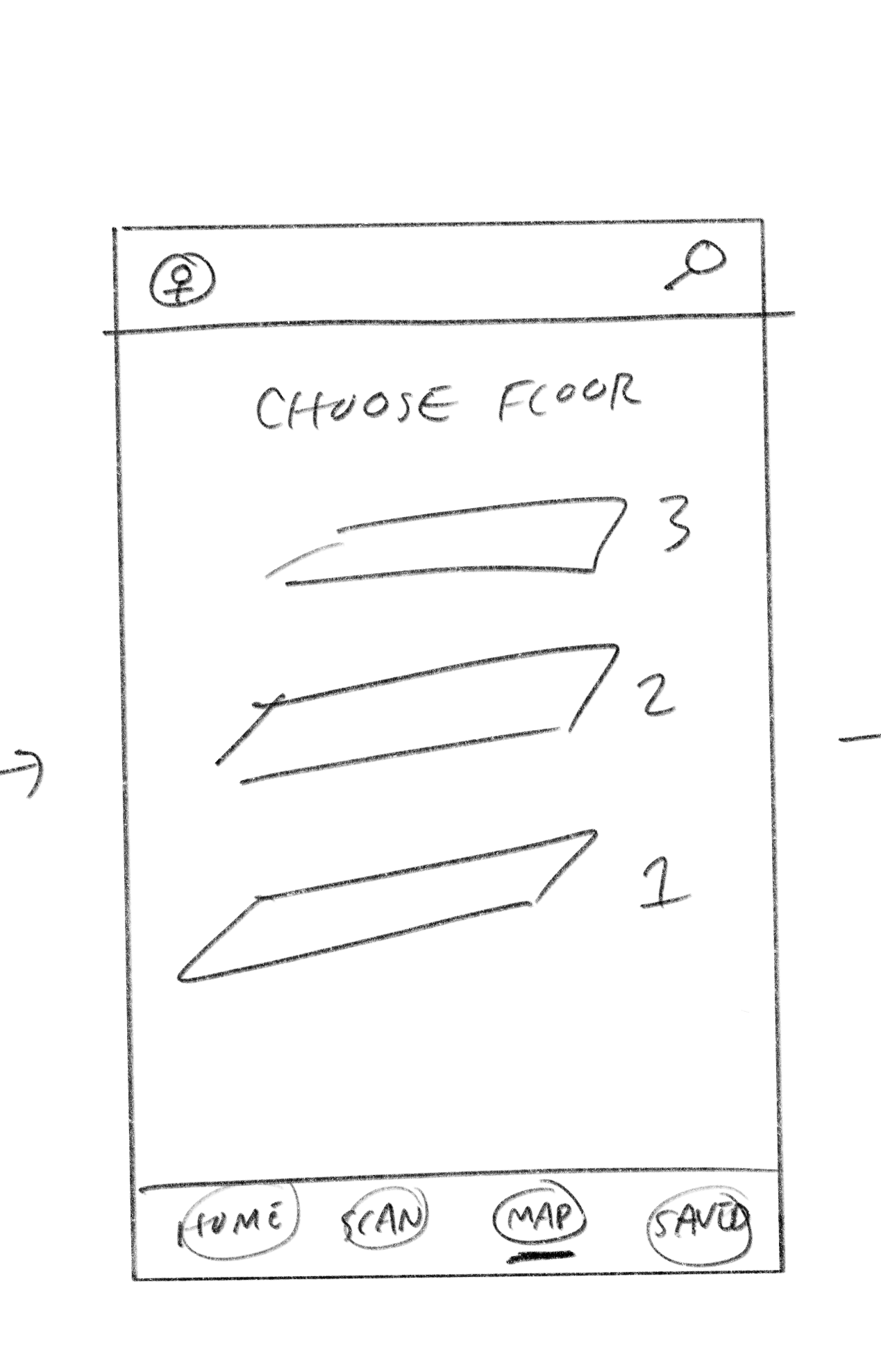
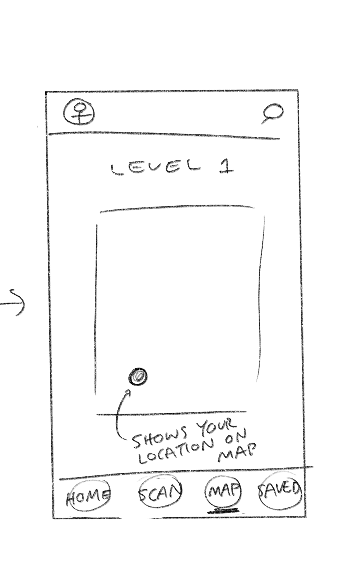
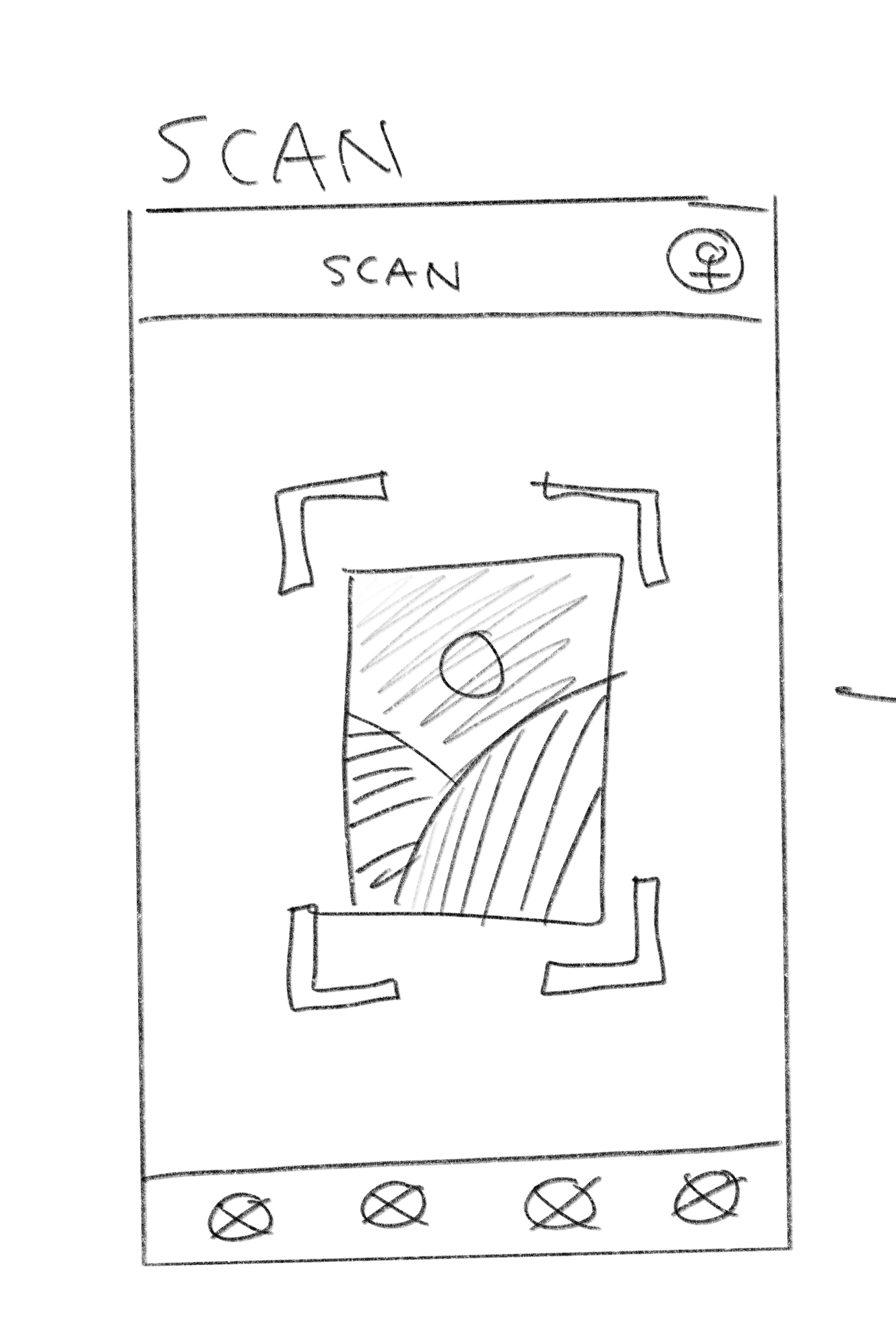
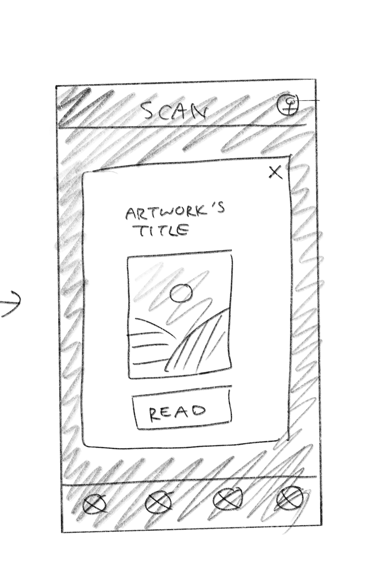
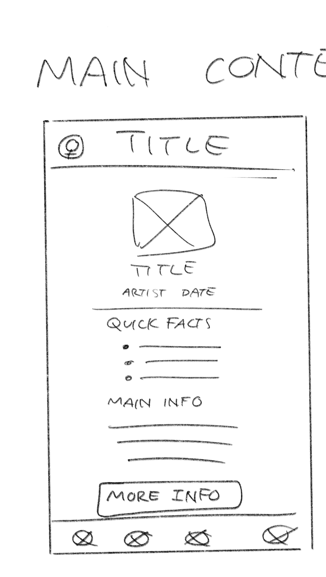
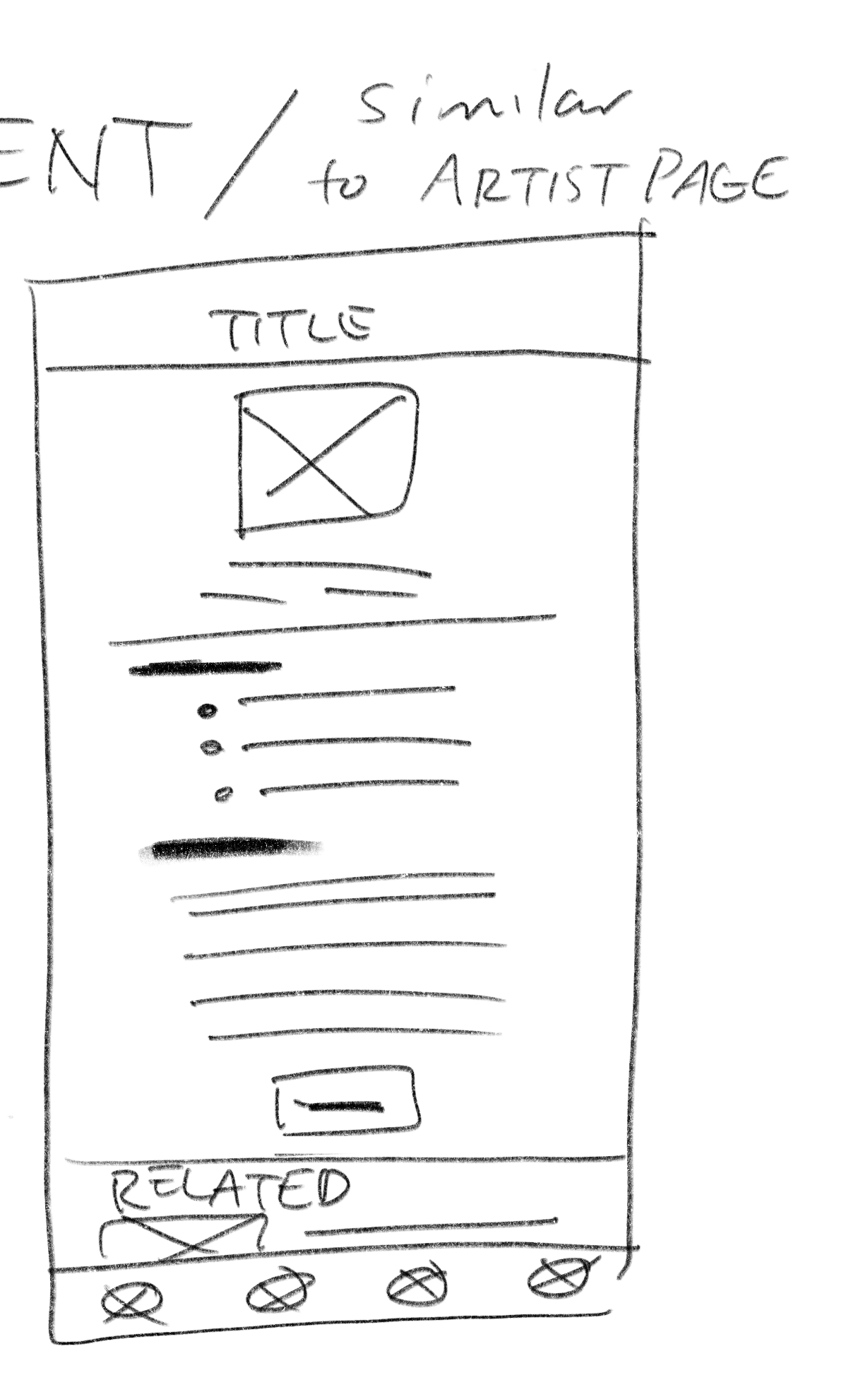
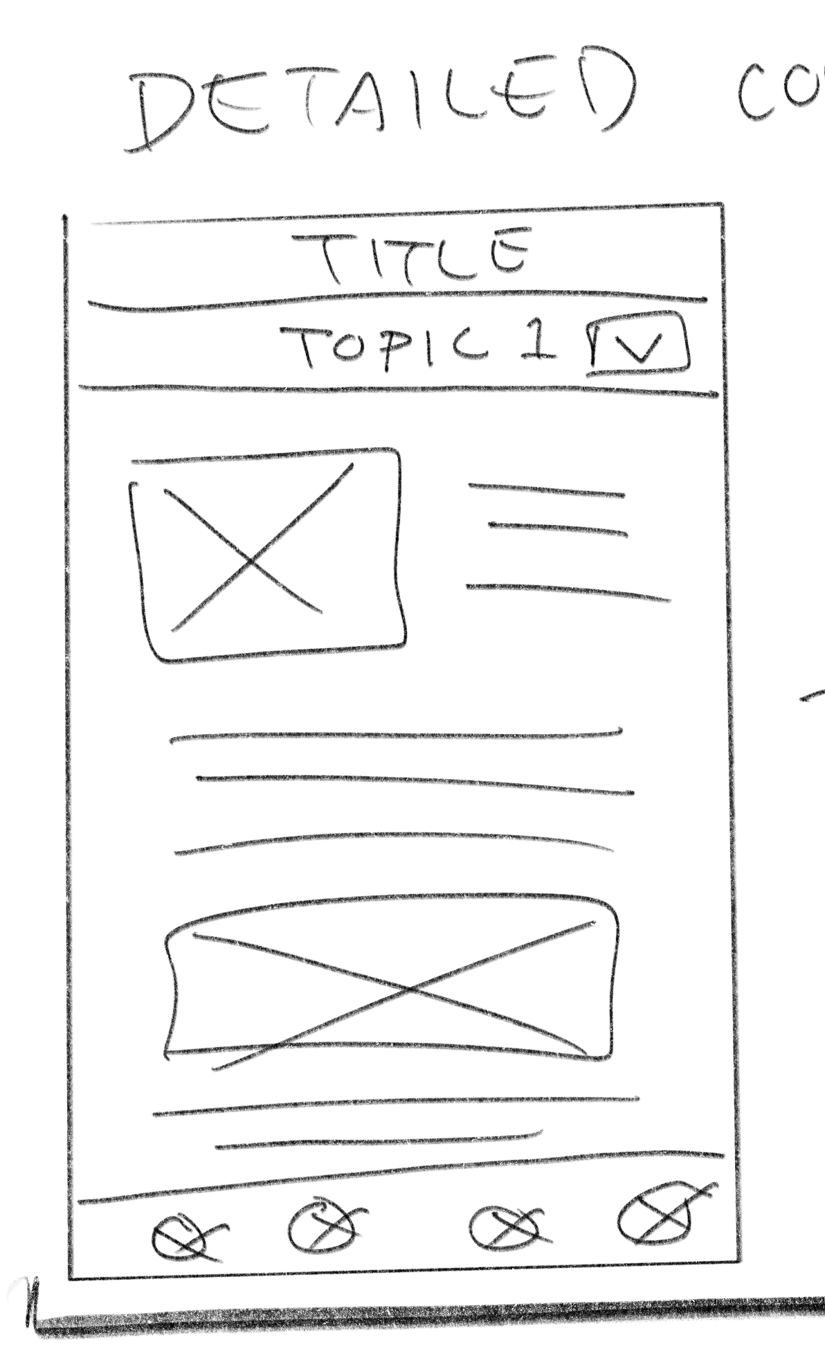
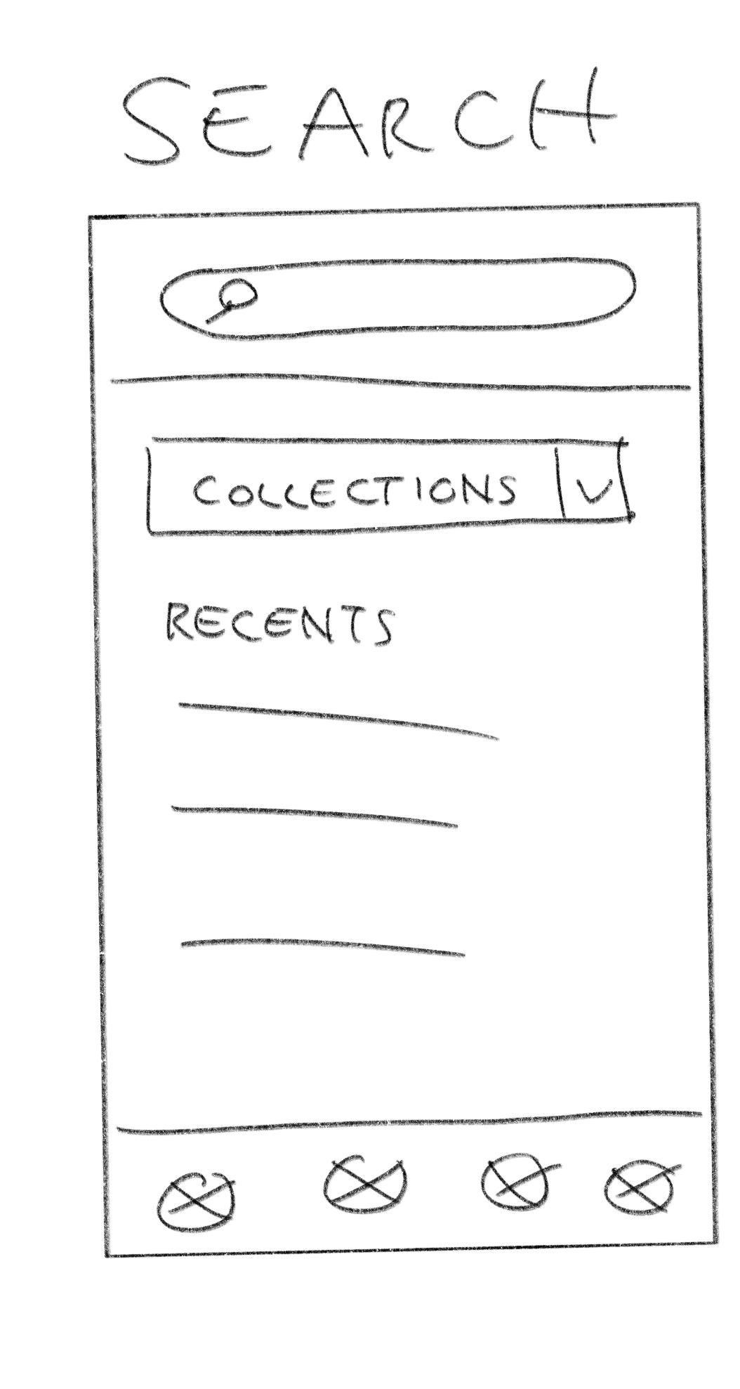
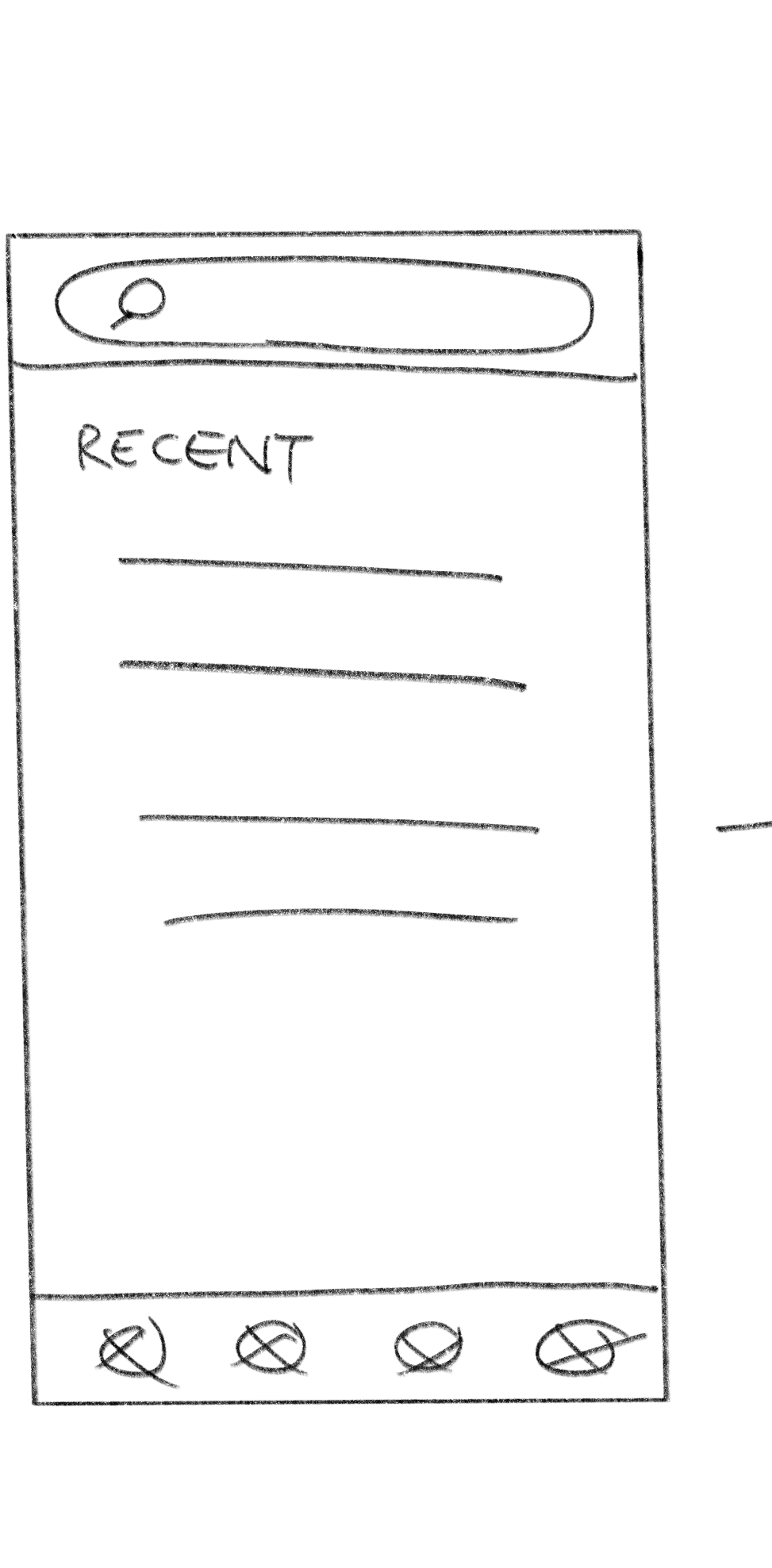
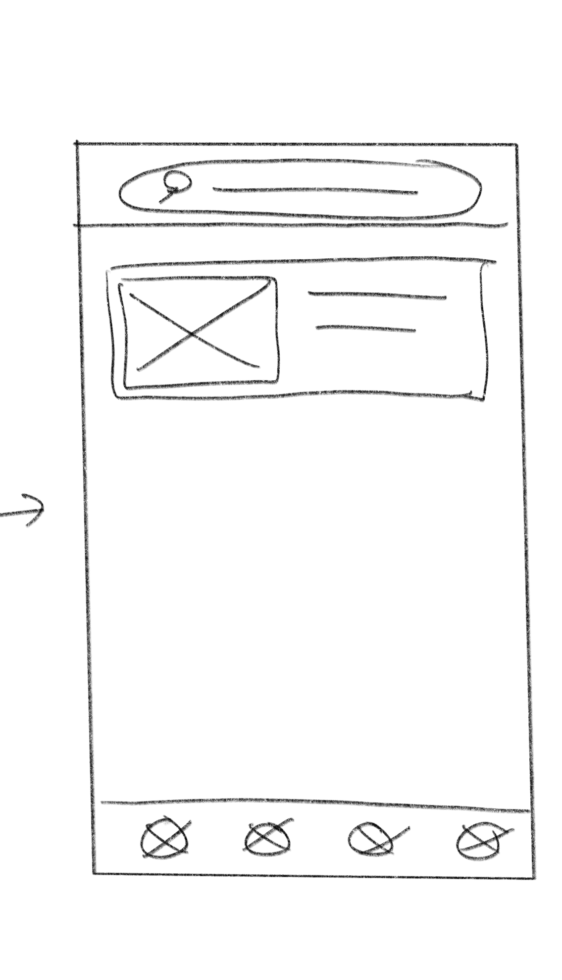
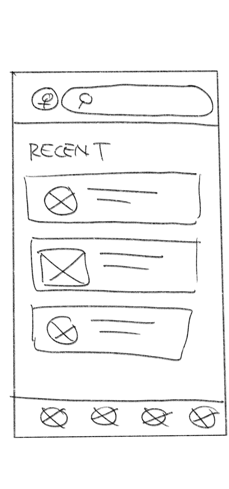
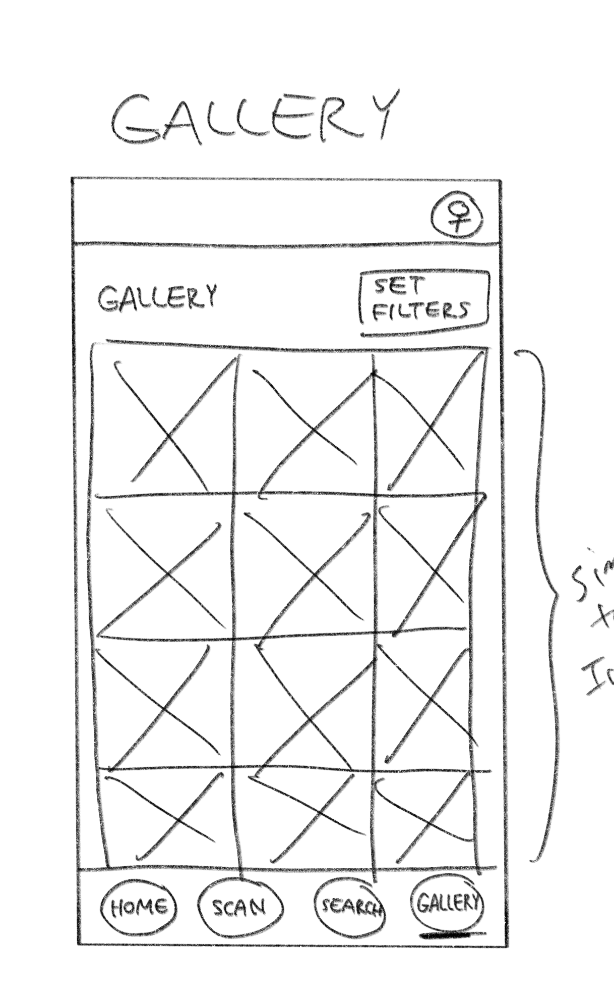
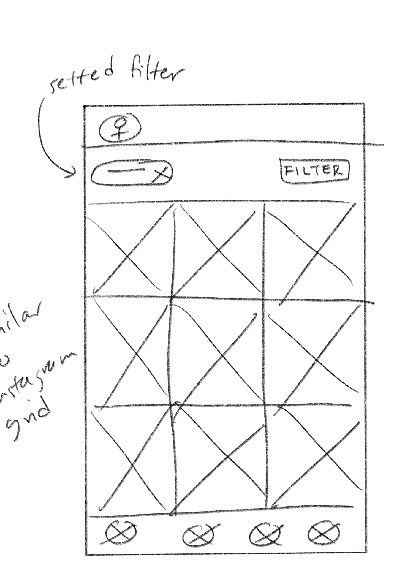
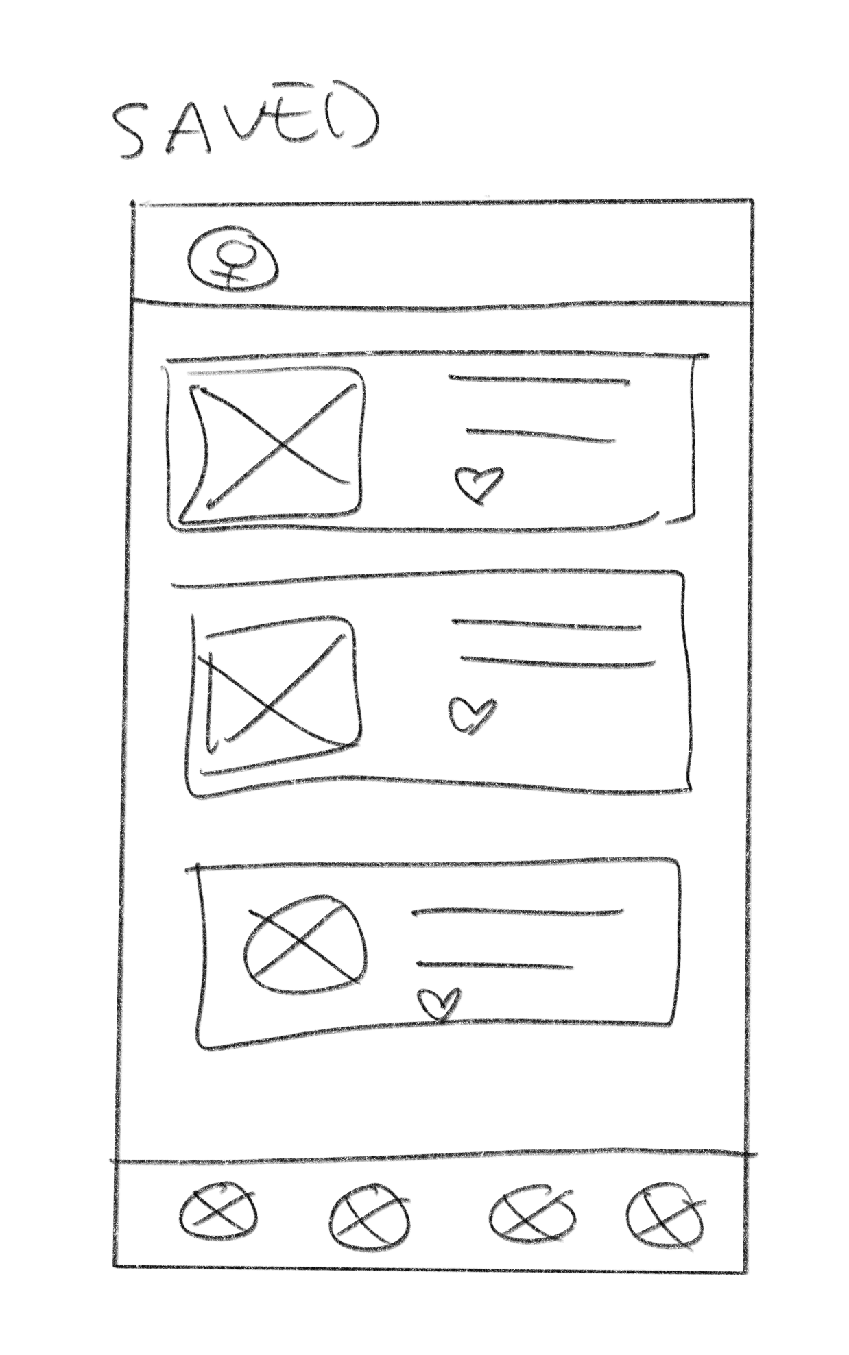
WIREFRAME SKETCHES

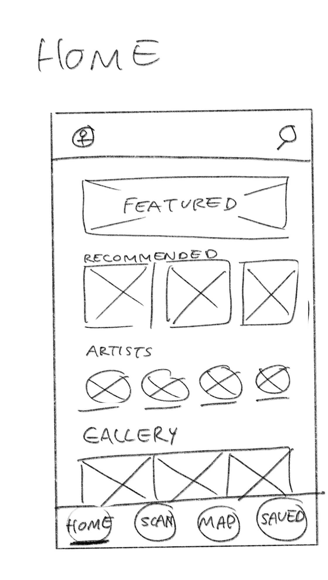
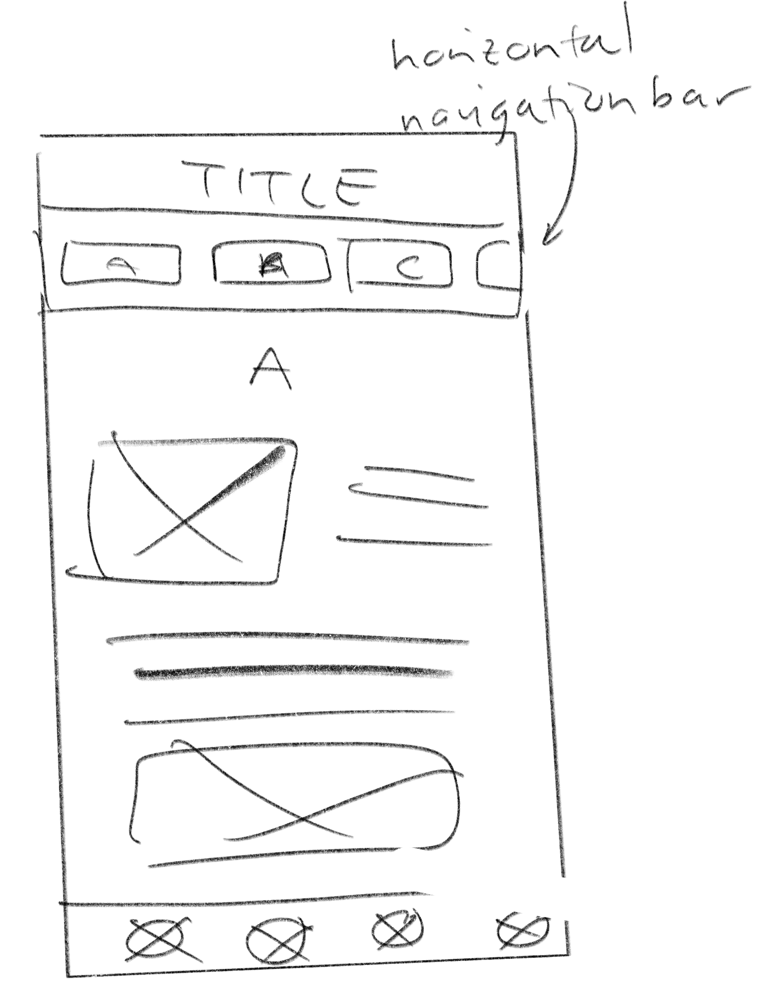
Low-fi Prototypes - User Test Insights
Once I created a working prototype, I ran usability tests to see what improvements I could do in order to meet the user's needs and beyond. Some insights from the tests include:
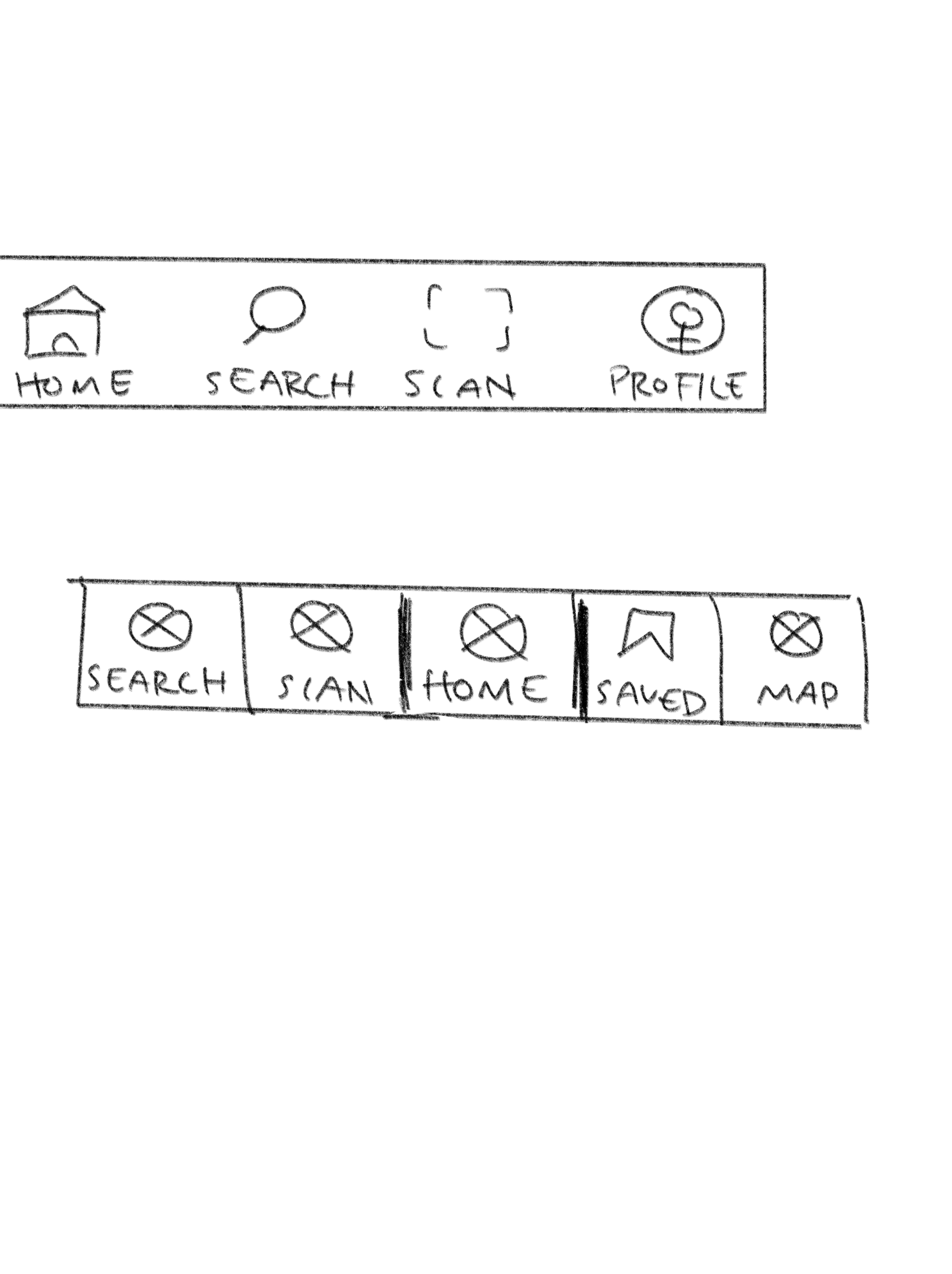
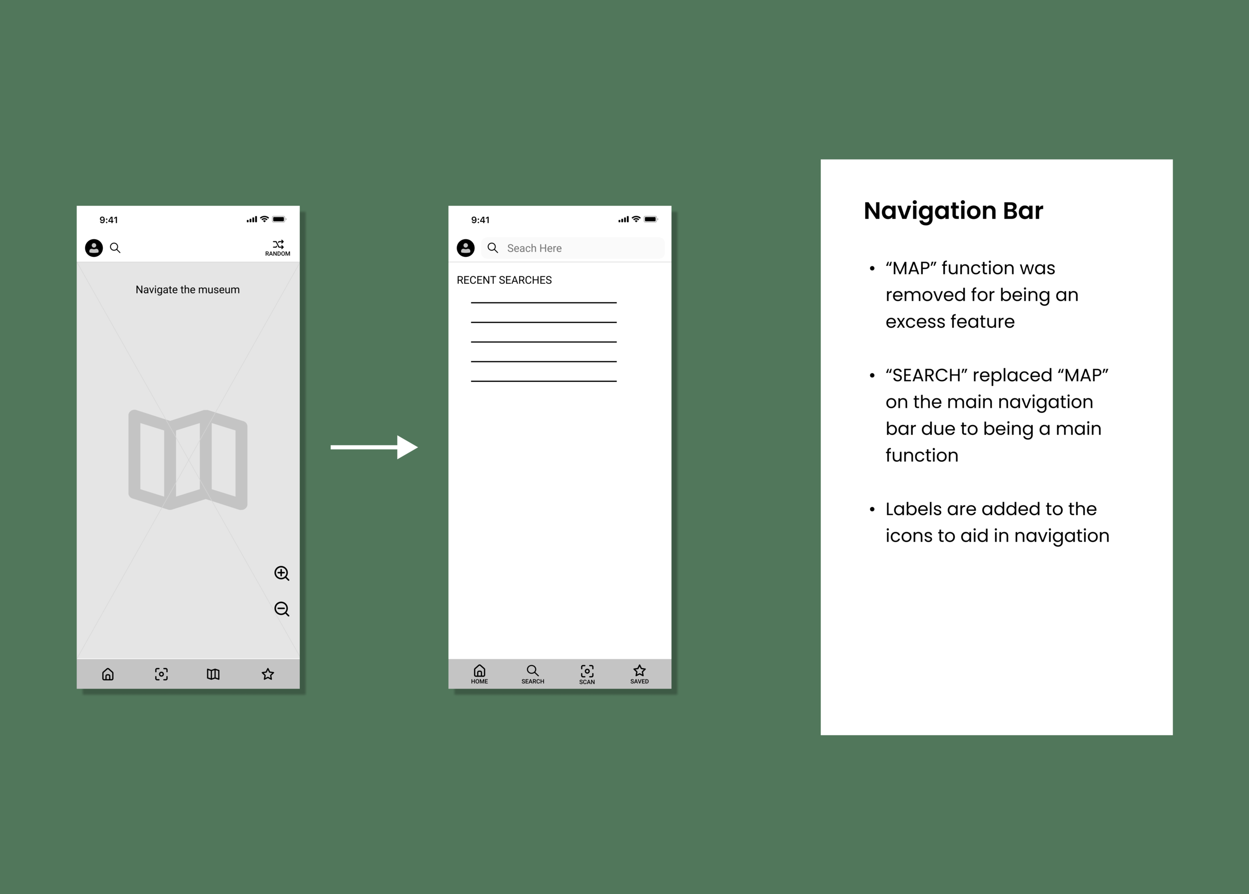
Less tech-savvy users preferred more limited features to feel less overloaded and more confident to navigate around
ACTION: The main navigation only focused on core features and supplementary ones were relocated or removed, such an interactable museum map
Some users did not understand symbols that are commonly used in other interfaces such as scan and shuffle
ACTION: Additional labeling was included
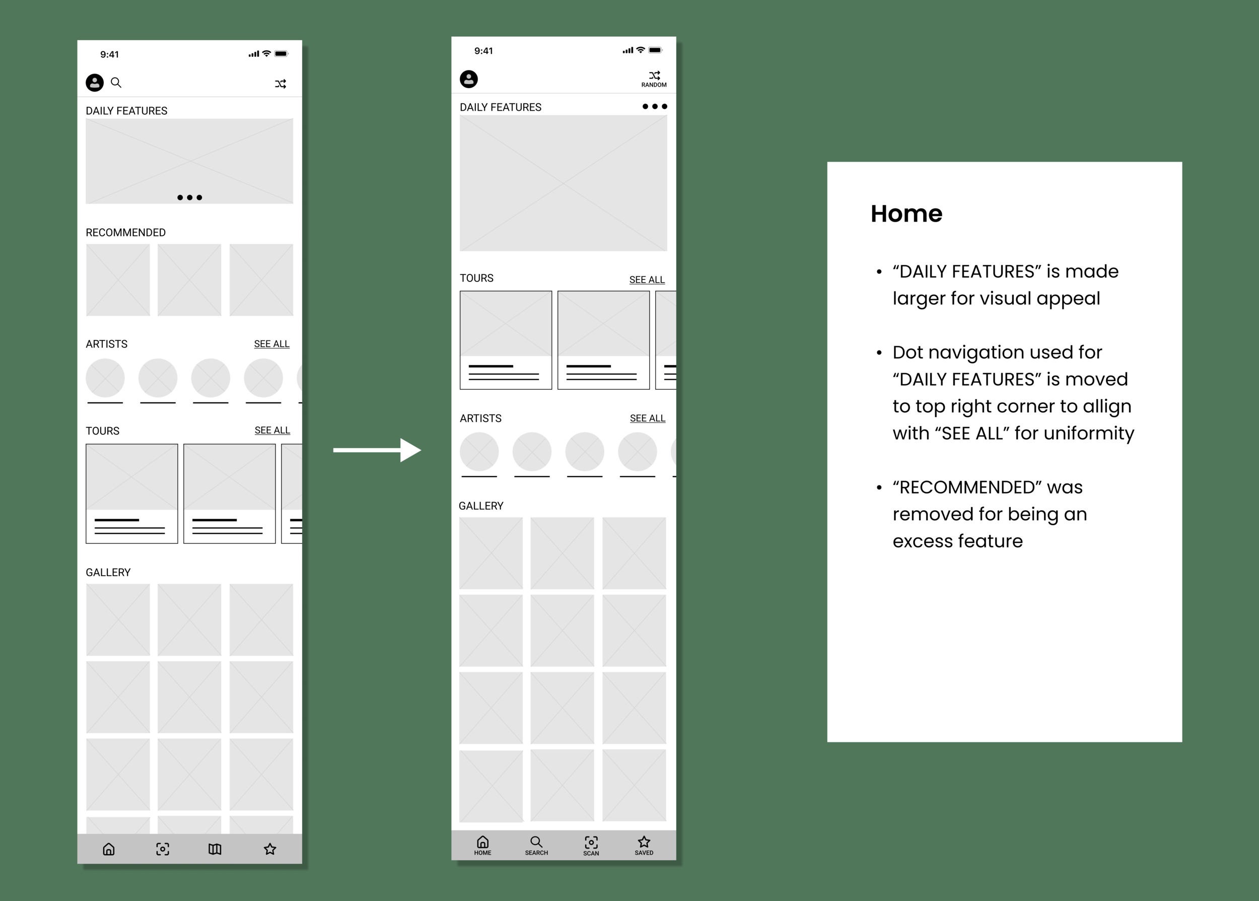
Most users found it frustrating to scroll through a lot of information before getting to a new section
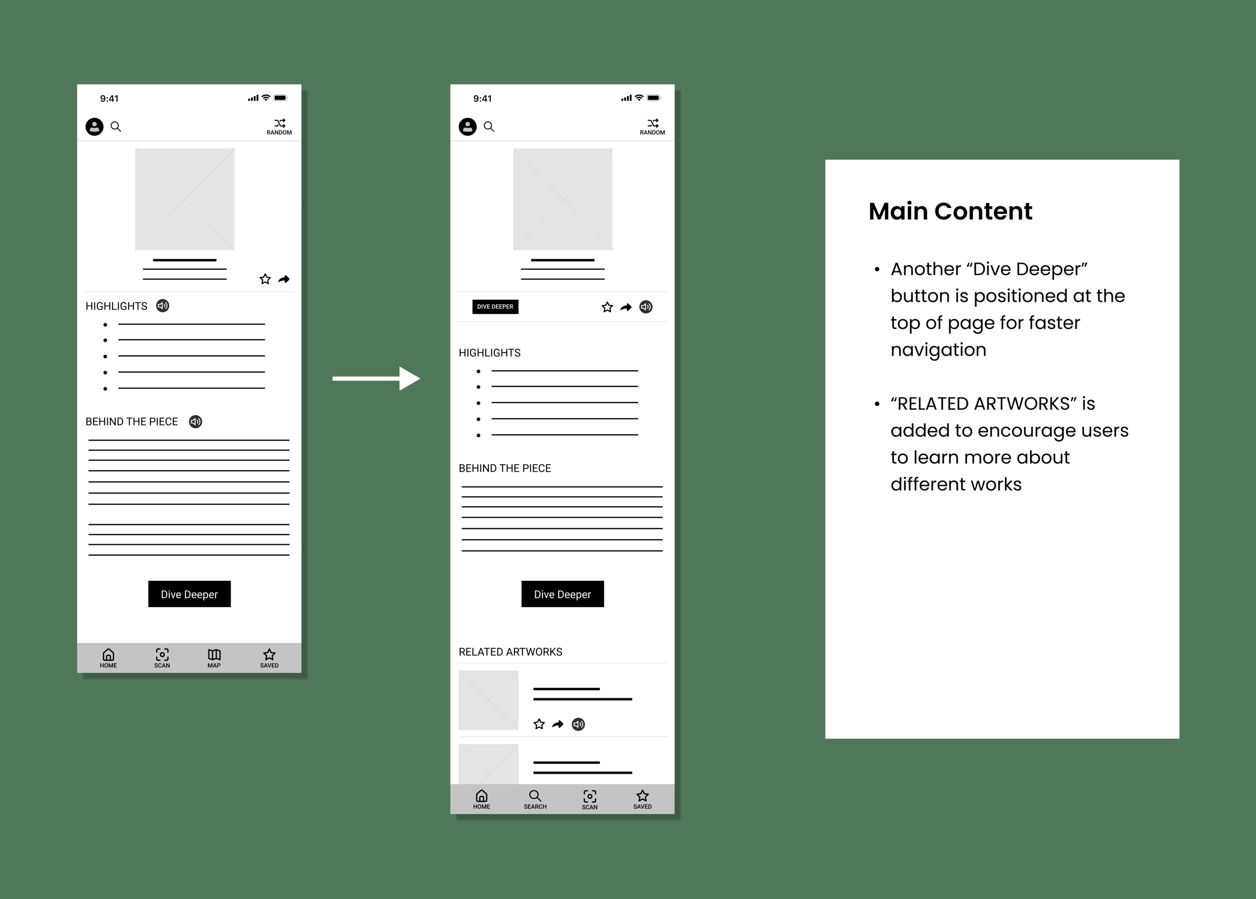
ACTION: Included “see all” options and positioned buttons, that accesses a new page of content, to be located at the top and bottom of a section
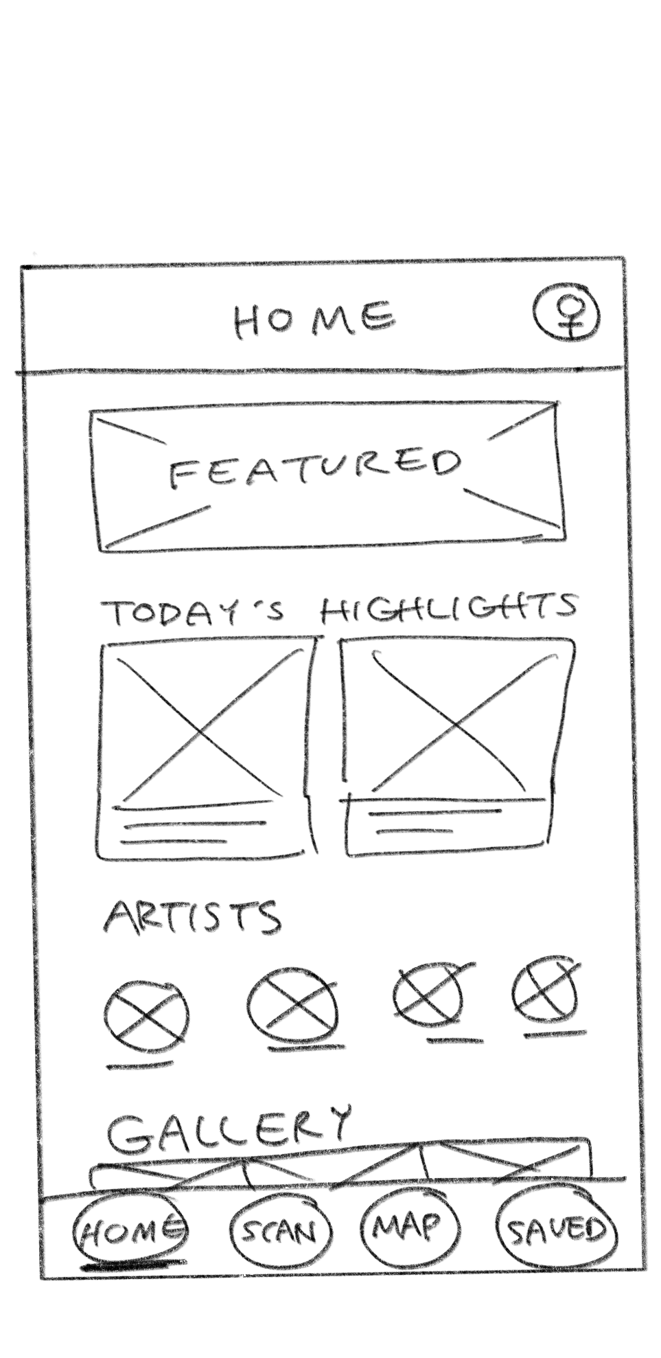
THE EDITS
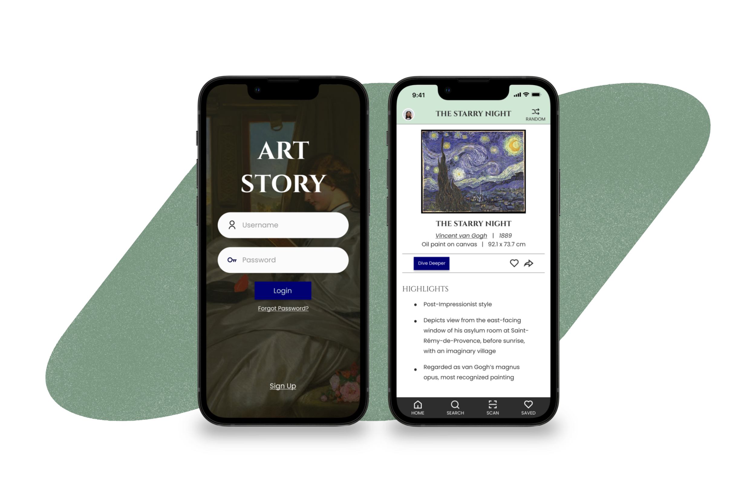
Final Design
After multiple rounds of revisions and working out the kinks, I landed on my final prototype.
The Main Features:
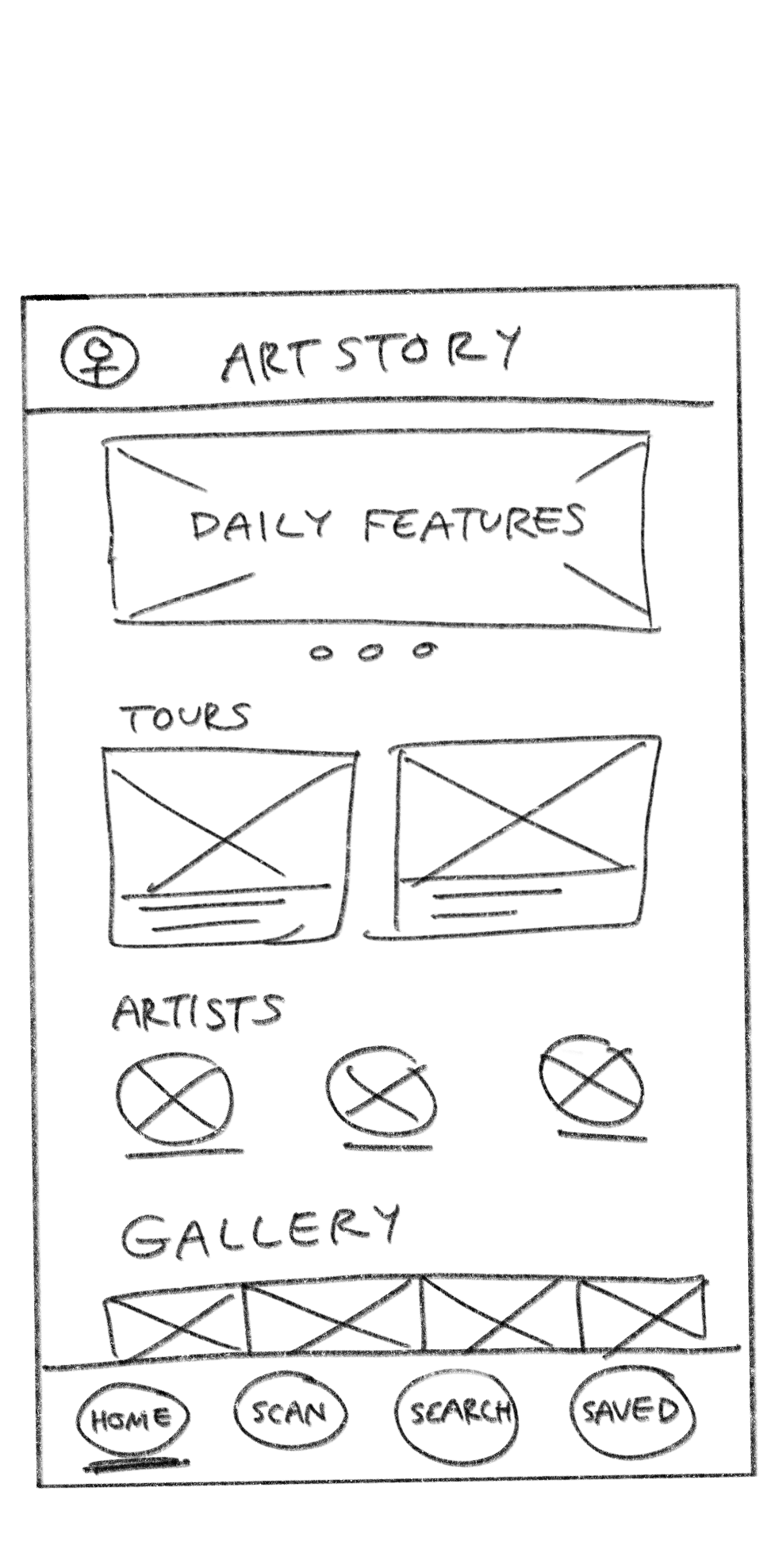
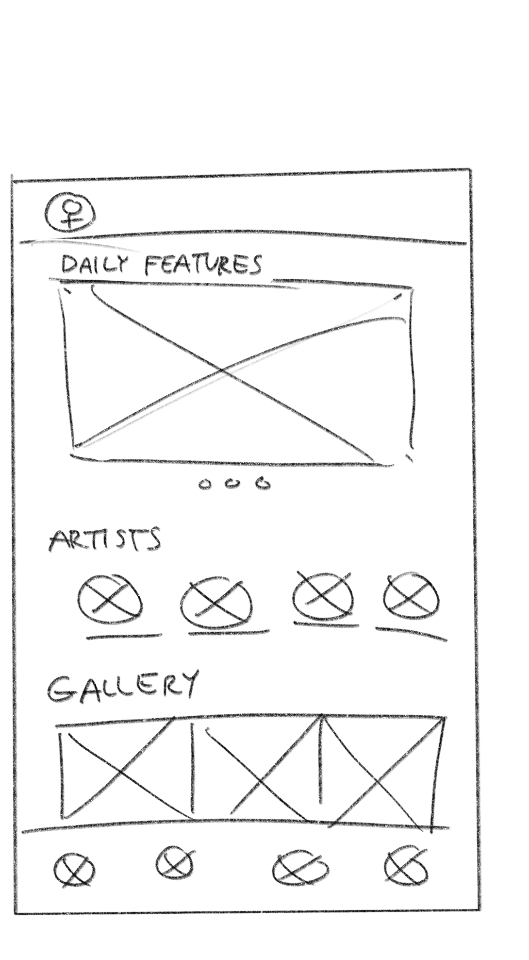
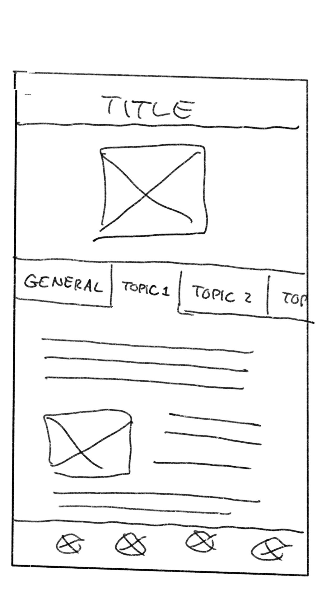
HOME
Encourages users to browse the museum’s collection.
Organized into sections, this allows users to not feel overwhelmed and feel more inclined to explore on days when a specific artwork is not in mind.
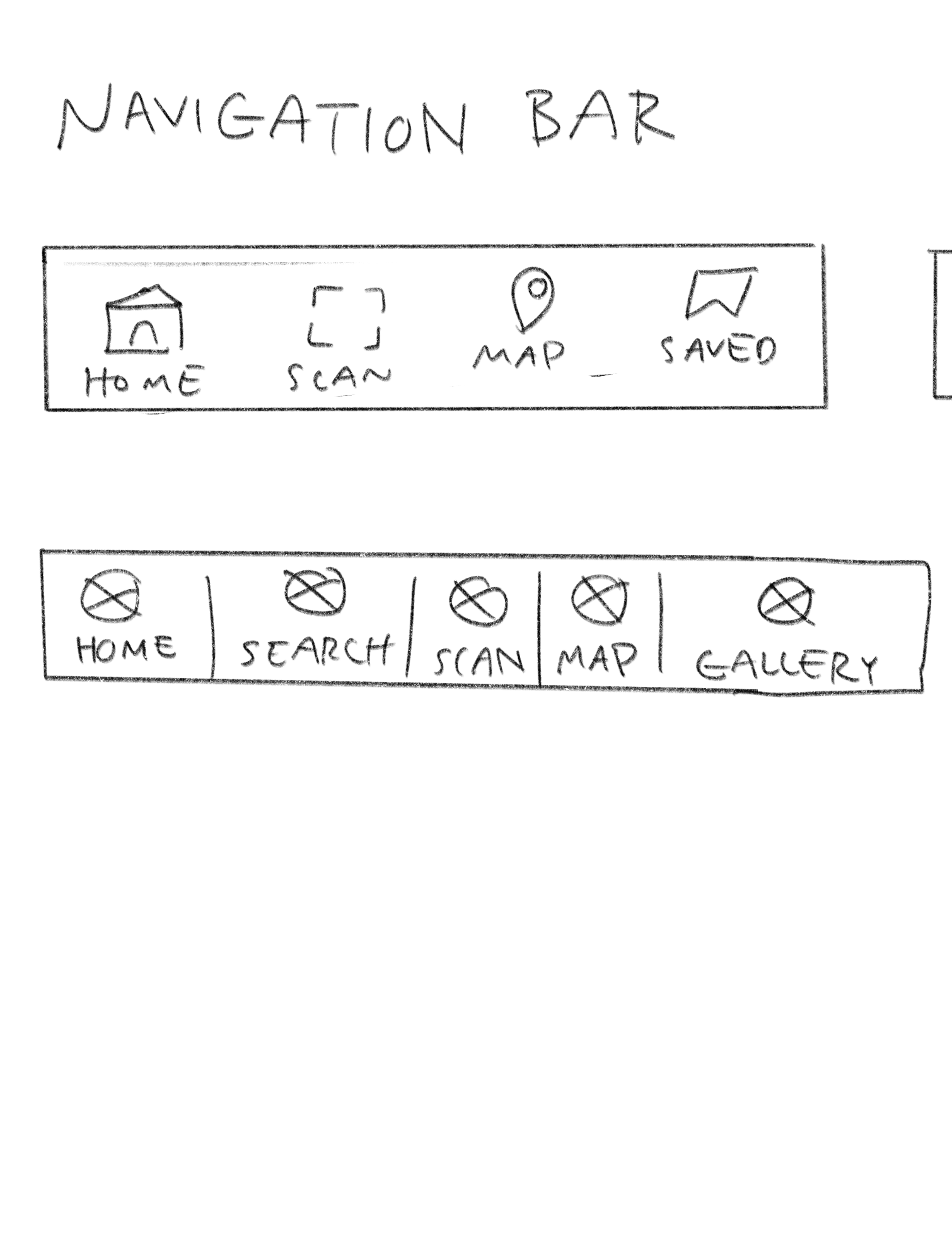
SEARCH & SCAN
To let on-site users find an artwork’s content more quickly than doing a manual search, the Scan function was included.
The Search and Scan functions are positioned on the main navigation bar for users to easily locate them.
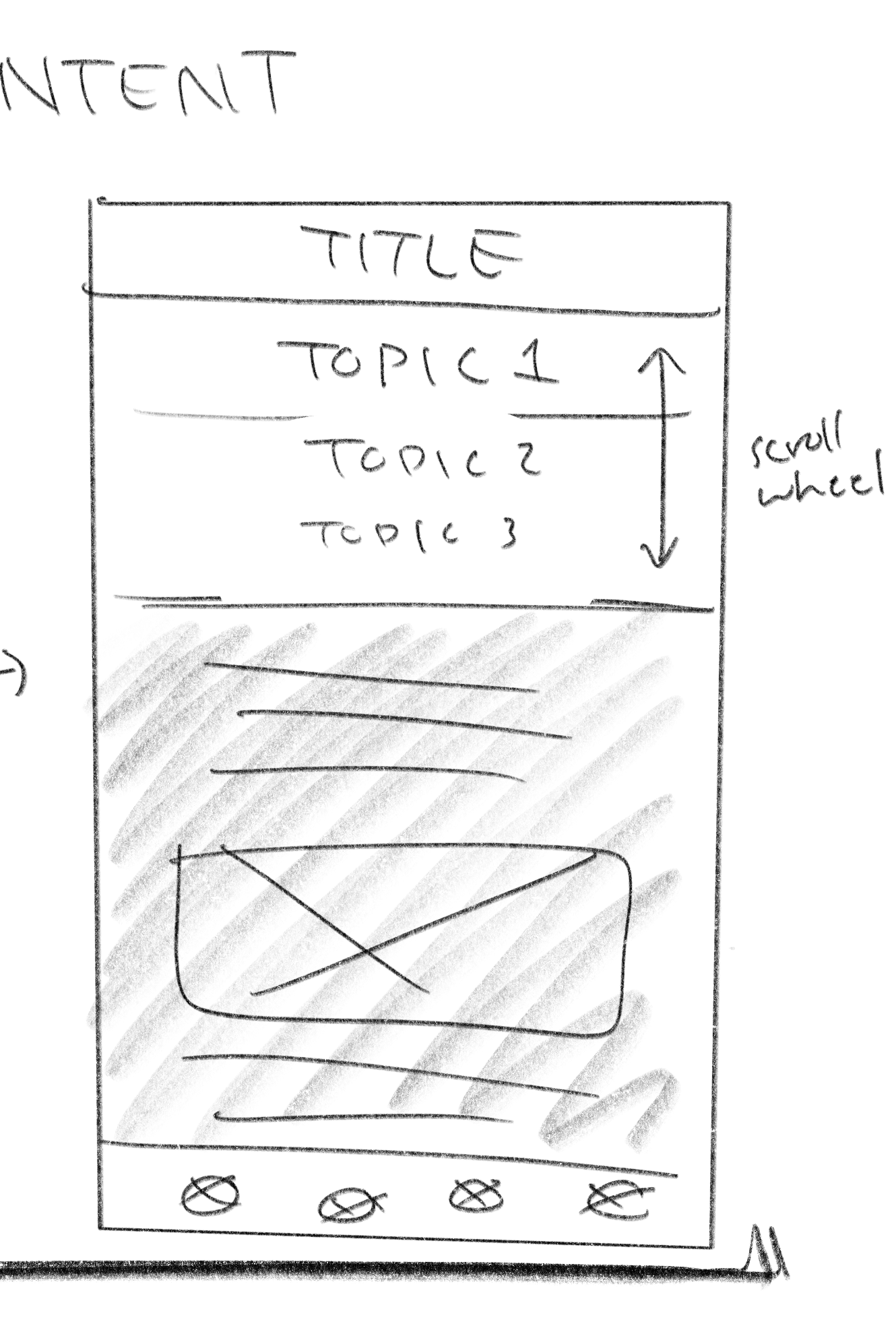
DIVE DEEPER
Dive Deeper acts as a mini art history lesson where users can be exposed to major elements of an artwork. Given that this could easily be overwhelming to more casual readers, a horizontal scrolling navigation bar is included. This bar allows the user to navigate through 8 topics:
History: discussing the historical background and influences of the time the artwork was created
The 7 main elements of art history: line, color, value, shape, form, space, and texture
From this, users can think more critically and be more conscious of design decisions, further increasing their appreciation for an art piece. This also provides art history students a detailed overview of what they could delve more into in their own personal research.
AUDIO
Incorporating audio became an important feature that increased accessibility for those who have a harder time reading text and had the ability to enhance any user’s museum trip.
For example, the audio can act similar to a personal tour guide, allowing users can keep their eyes on an art piece while listening to the content.
Reflection
Given that this was my first UX project, I learned a lot in how to navigate a full project and was an overall enjoyable experience that solidified my interest in doing design.
Key Takeaways
No design is perfect: By having done constant changes and updates, along with having new ideas popping up almost daily since starting the design process, I quickly fully understood how an actual final UX design is non-existent because changes and improvements are always possible with new knowledge.
Increased Accessibility Sensitivity: From this project, I found myself in multiple conundrums of how to make ArtStory more accessible and visually appealing. As I delved deeper into the project, I spent a lot more time than I expected on testing out different layouts, color combinations, and options to make ArtStory more accessible. Due to this, I slowly began to subconsciously notice visual accessibility pros and cons of apps and websites I often visit.
Staying Diligent: Given this was my first major UX project and part of a self-paced Google Coursera UX Course, it involved a lot of self-discipline and initiative in completing the app and not cutting corners. This involved reminding myself of my end goal of gaining the ability to create products where users, such as my parents, confidently use and enjoy, setting weekly goals, and scheduling my time better alongside my college courses.
Though ArtStory does not meet all the needs and wants for an active museum goer and a casual art history reader at home, I hope this project can act as a gateway to help the average person become more interested and appreciative of the art world.
Final Design
Further user tests were done with the high-fi prototype, and after many other alterations and overcoming slumps, I’m proud to present the final deliverable!
Home
Encourages users to browse the museum’s collection.
Organized into sections, this allows users to not feel overwhelmed and feel more inclined to explore on days when a specific artwork is not in mind.
Search & Scan
To let on-site users find an artwork’s content more quickly than doing a manual search, the Scan function was included.
The Search and Scan functions are positioned on the main navigation bar for users to easily locate them.
Dive Deeper
Dive Deeper acts as a mini art history lesson where users can be exposed to major elements of an artwork. Given that this could easily be overwhelming to more casual readers, a horizontal scrolling navigation bar is included. This bar allows the user to navigate through 8 topics:
History: discussing the historical background and influences of the time the artwork was created
The 7 main elements of art history: line, color, value, shape, form, space, and texture
From this, users can think more critically and be more conscious of design decisions, further increasing their appreciation for an art piece. This also provides art history students a detailed overview of what they could delve more into in their own personal research.
Audio
Incorporating audio became an important feature that increased accessibility for those who have a harder time reading text and had the ability to enhance any user’s museum trip.
For example, the audio can act similar to a personal tour guide, allowing users can keep their eyes on an art piece while listening to the content.